Ugh, Adobe.

I’ve used a pair of custom fonts, Museo and Museo Slab on this site since I debuted my custom child theme on New Years Eve of 2011. I originally got the fonts through a company called TypeKit, which Adobe bought a couple of years ago.

A nice security feature of the CitiCard app is that I get notifications when a card not present transaction happens . Saturday, I got a notification that I’d been charged by Adobe. I assumed at that point it was for my annual font license, and didn’t think much of it.

Then today, I got an email from Adobe, “You’ve bought Adobe XD, but haven’t downloaded the app yet.” WTF??? I don’t remember ever buying Adobe XD, a vector-based user experience design tool, and it’s not a product I would want. My first thought was that my Adobe or credit card account had been hacked, my second thought was that maybe something got fouled up with the font subscription, and that I should talk to Adobe.

It is not easy to talk to Adobe. They make it very hard to talk to Adobe. You can’t find their number on their website, and and when I found the number on gethuman.com, I fell into a phone tree that I escaped only by semi-randomly mashing on the phone keys, then waiting on hold for a while.

Fortunately, the first person I spoke to gave me the essential clue. He told me that I’d had the subscription for a year, and that it had simply just renewed. I didn’t remember subscribing a year ago, so I dug through my old emails, and found this:

You’ve subscribed to Typekit — thousands of fonts you can use on the web or your desktop. As we mentioned in our last email, we’re making some changes to our service that will affect your plan for this email address …

As part of our move to Adobe Fonts, we have discontinued standalone Typekit plans, and will not bill you again for yours. You’re still covered for fonts on web and desktop and there will not be any interruption to your font service. 

In early 2019, we’ll add a free year of Adobe XD CC to your Adobe account, which will extend your font licensing for a full year. This is just one of the Creative Cloud single-app plans that includes our complete library of fonts.  

At the end of your free year, you can renew Adobe XD or choose another Creative Cloud plan that fits your needs and price point. There are more fonts in the library now than we’ve ever had before (over 14,000), and we’ve lifted sync and domain limits to make them a lot easier to get to. 

I hadn’t paid much attention to it, because I didn’t care about the free year of Adobe XD. I simply perceived it as a free perk I wouldn’t use. What I didn’t understand was that in order to continue the subscription — and the Museo fonts aren’t included in the free level of Adobe fonts — I would have to have some sort of Creative Cloud subscription.


I’ve used Photoshop off and on for decades, starting with Photoshop 3. My own personal copies were never for professional use, so I never saw the need to keep it up to date every year, especially when the annual upgrade was a couple hundred dollars. Still, I did buy about six different versions, culminating in Photoshop CS 5. Photoshop CS 6 didn’t seem like enough of an upgrade to bother with, then Adobe switched to their subscription model, and I held onto CS 5 for as long as I could. It became crash-prone two versions of macOS ago, and unusable in macOS Mojave. I’ve been using other image editors instead, like Pixelmator Pro and Acorn, but haven’t felt as comfortable with either as I do with Photoshop.

I actually have been looking at Adobe’s Creative Cloud plans for a little while, but they don’t offer the bundle I would really want: Photoshop + Illustrator at a reasonable price. Photoshop and Illustrator singly are each $21/month. They do offer a “Photography” plan which combines Photoshop with Lightroom for $10/month, but I don’t really need Lightroom — I’ve just finished settling into Apple Photos, and I don’t like the idea of my photo library being bound to an Adobe subscription plan

Nonetheless, once it became clear that I had to have some sort of Creative Cloud plan to keep the fonts on the site, I decided I would rather have a subscription to an app I would use. For me, that’s Photoshop, and the cheapest way out is the Photography plan.

I’m not happy at all with this situation.

  • Their initial email announcing the demise of TypeKit should have made it clearer that some sort of Creative Cloud subscription would be required for more than the free tier of TypeKit
  • If I have to have an app, last year’s email should have let me pick the app I wanted to tie it to. The way the email was worded, it seemed like Adobe XD was just a free perk they were throwing in, one that I disregarded since I didn’t value it.
  • I’m not happy with the plans available. I’ll probably try Lightroom, but I don’t really want it. I definitely don’t want the cloud features, I tend to do my stuff on one device
  • I really wish they had a Photoshop / Illustrator bundle. Or a limited app bundle. If they’re willing to bundle Photoshop and Lightroom for $9.99 /month, surely they could afford to sell Photoshop + Illustrator — or any two apps — for a reasonable rate. The two options are to buy both apps singly for $20.99 / month, or to buy all app access for $52.99 / month — but I neither want all 20 apps, nor can I afford them.
  • Adobe’s telephone support is ridiculously bad. The number isn’t on the website, the support options aren’t helpful — and I would not have deduced that the issue was the initial “free” addition of Adobe XD to my account a year ago, because I’d scarcely noticed it a year ago, and had forgotten it since. To be fair, the first operator I spoke to first did pick up that it was a subscription I’d had for a year, but couldn’t address why I had it — I had to look through my old emails to find out why. I then got transferred through three other representatives before determining, yes, I had to have a Creative Cloud subscription to get the fonts. To the credit to the final operator I spoke to, he did price out the cheapest app for me, but if I have to have a subscription, I’d rather get something I want.

I guess it’s good to have Photoshop again. But I’m feeling rather shaken down right now, and it doesn’t feel good.

Making of a Christmas Card, 2016

This year was a bit unusual in that I actually had two competing ideas for a card, and I was able to do them with a minimum of stress. The first idea was to get some pictures of Christmas lights at night, and I actually brought the tripod with me into work, and went out shooting afterwards at the Faneuil Hall Marketplace. I did get some good stuff there, but in the end, I decided to go with my second idea. Continue reading

Stick a Fork in It…

Back on May 1st, I scanned a slide of myself with my cousins in front of Old Ironsides. The slide must have come into contact with some darkroom chemicals, as it was heavily stained and spotted, not to mention covered with hairs, fungus and other crap:

Before retouching and cropping

Before retouching and cropping

Obviously, it’s in pretty bad shape, but still… there was something there I wanted to save. So I went to work, and all other scanning work has been on hold (save one other, also difficult, slide) while I worked on this one.

The first step was to adjust color on the unstained parts of the slide, which I did via an adjustment layer. The next step was to go after the fungus in the sky, and all the little blue spots in the black parts of the ship. Those were the easy parts. Next, I had to fix the blue spot over Billy’s eye, and the spots on his shirt. At some point I conceded the right fifth of the image and cropped in much tighter to get rid of most of the blue blob. For the rest, I added a series of masked adjustment layers to remove the blue color and change the tonality, until I was finally able to get the rest of the bow passable.

It’s certainly not perfect. I’ll plead guilty to a certain amount of retouching fatigue on this one. I do admit I like the looser composition of the original better. But still, it’s a damned sight better than what I started with:

After restoration

After Restoration


Restoration

I was looking through my old negatives to see if I could find the negative of the picture of my Dad that I posted last September, when I came across yet another box of slides. The box contained a bunch of rejected slides, pictures that were either too light or too dark to be part of a slide show. That was then. Now, we can edit pictures digitally, so I figured they were worth a second look. I found about fifteen that looked like they might be worth a quick scan to see if there was anything worth the work of fixing them.

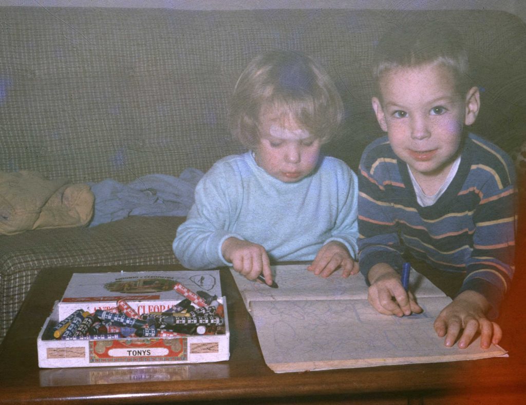
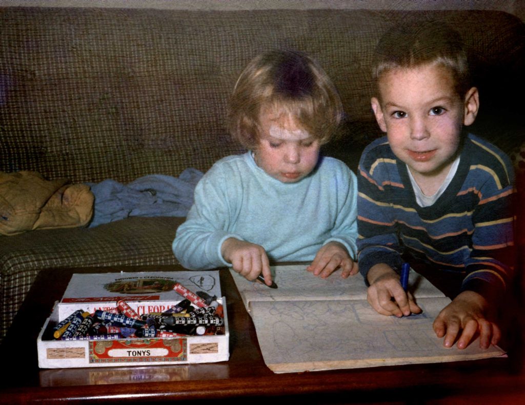
Of the first four, this was the most promising. It’s a picture of my sister and me from 1963, taken by my father.

Nancy and Me - before

Nancy and Me – before

It looks like it was from the tail end of a roll — light fogged at the right and top, and covered with fungus.

Nancy and Me - After

Nancy and Me – After

Not bad at all. So what did I do?

  1. I cropped much of the fogged area out of the picture. (The ‘Before’ picture is actually cropped).
  2. I added an initial overall Curves adjustment to make the darks darker and the lighter areas lighter, and adjust the color.
  3. I added a second Curves adjustment on top of the first, masked with a layer mask with a very soft bottom edge, over the top half of the picture. This layer makes the top part of the picture darker and more contrasty, and further adjusts the colors.
  4. Used the Spot Healing Brush to clean up the biggest bits of dirt on the scan. Things like hairs and especially large clumps of mold.
  5. Cleaned up some (but not anywhere near all) of the mold tendrils on the faces. Just the very largest spots — there was way too much mold damage on this picture to spot them all away individually.
  6. Dealt with the blue mold spots. These occur where the fungus has eaten through the yellow dye layer of the emulsion. For some, like the blue spot on my face, and some of the blue spots on the couch, I used the Clone Stamp Tool. In other places, like along the back wall and the spot in my sister’s hair, it was sufficient to use the Sponge Tool to desaturate the blue away.
  7. I used the Sponge Tool and Burn Tool to desaturate and darken the edge fogging on the right side of the picture.
  8. Finally, I duplicated my layer, ran the Dust and Scratches filter on it, masked it, and then removed the mask away from any edges.

The problem with the Dust and Scratches layer is that it works by blurring the spots away, and can also blur away detail. Usually, I only need to unmask the Dust and Scratches layer where there are dust spots. Usually, if there are particularly bad areas, they’re confined to the sides, which are out of focus anyway. Not this picture. I had to accept this image was not going to be as clean as I’d like.The fungus damage was way too extensive, and covered every square millimeter of the film. So I unmasked everything away from any sort of edge. For example, I unmasked the skin if the faces, but left the edge of the lips and eyes from the base layer showing, to retain the sharpness of the edges.

Overall, though, considering the state of the original image, not too shabby, even if I do say so myself.


Slide Scanning Update

I was just re-reading my post on my slide scanning workflow, and thought I’d post an update. I’m just about to finish my second carousel, and I’ve made a change that has sped things up a bit.

First of all, I’d like to mention that VueScan no longer requires the the slides to be set to “Mirror”. There was a update a couple of months ago that took care of this issue.

Second, I’ve found a better way to use the “Dust and Scratches” (DS) layer that I generate using the old Polaroid Dust and Scratches plugin. I would imagine this technique would also work with the default Dust and scratches plugin too. To recap, I found that the Polaroid dust and scratches plugin did a very good job of getting rid of dust spots, and to a lesser extent, fungus, but it also left artifacts, and removed detail.

Kids watching my uncle feed a squirrel

Cousin Susan, Uncle Tom, and neighbor watch my Uncle Dick feed a squirrel. Circa 1955

Previously, I was running the filter on a copy of the file, and then adding the result as a layer, and erasing the layer where it was causing problems. This created a lot of work, because I had to carefully inspect the whole image in order to erase the layer where it was causing problems.

Eventually, I realized it would be better to reverse things. Now, I add the layer, and immediately add a layer mask to it in Photoshop, making the layer completely transparent. Layer masks allow you to make make parts of layer transparent or translucent. When the mask is black, the layer is transparent. Where the mask is white, the layer is opaque. Gray generates a semi-transparent area. Once the mask is created, you can paint on it with the brush or any of the other tools, allowing very good control of what parts of a layer are visible. It’s a great tool for creating collages.

So I start off with a completely transparent DS layer, and then use the graphics tablet and brush tool to unmask the layer over dust spots. Generally speaking, for spots and fungus tendrils, it’s faster than using the Spot Healing Brush, and working this way allows me to avoid applying the layer to areas with a lot of detail. For hairs, scratches, and areas of detail, I find the Spot Healing Brush works better—it’s more complete, and it’s less likely to add artifacts or remove detail.

I’ve found this speeds things up quite a bit, since I can keep the brush away from edges and detail, only applying the layer where it’s needed. This means I don’t have to keep checking the DS layer to make sure it isn’t obscuring detail. It’s also usually faster than the Sport Healing Brush — my aim doesn’t need to be as accurate, and I don’t have to fuss with it as much. Using this technique (plus the fact that the current batch of slides hasn’t been as dirty as the first batch) meant that I was able to get many more slides scanned for my aunt than I anticipated in time for Christmas.

Discoveries in the Details

The most boring, mind-numbing, tedious part of the slide scanning I’ve been doing has to be dealing with the dirt on the scans. Although I did have one slide this week that only took about 5 minutes of work from start to finish, some of them entail hours of work zoomed in close, retouching the scan spot by spot.

And yet… it also means I’m looking at these pictures more closely than I’ve ever looked at them before. And I’m noticing details in them that I never noticed before:

  • In the self portrait of Dad that I posted last week, I noticed he had a pipe in his hand. He almost never smoked a pipe when I knew him; it was always a cigar.
  • There’s a picture of my mother looking at a kiddie train ride somewhere; we’ve never been able figure out where. She doesn’t remember. But you can see a bus in the background, and after lightening up the picture in Photoshop, it looks like it’s in MTA* livery. So it’s probably in the Boston area.
  • There’s a picture of the two of them sitting on a picnic table, which I’d assumed was taken down the Cape. But when I was zoomed in close, I noticed Dad had the same kind of tag on him that was in another picture of my mother, grandmother and great aunt that was taken at Old Sturbridge Village.
  • One of the pictures I worked on in June was a picture of my brother Brian. It’s a long shot of him on a pony, and I’d never looked very closely at the face before. And while their faces are dissimilar, the expression on his face is exactly the same as one I’ve seen on his son Matt’s face dozens of times.
  • In the picture I finished last night, I’m holding Dad’s folding medium format rangefinder camera while he was obviously shooting the slide in 35mm. I don’t remember seeing the medium format pictures–are they prints filed away in albums, or are they the medium format slides I haven’t seen in decades?

I remember Dad’s cameras very well. At the time the picture was taken, I was 14, and I think I was just holding the camera for him–it’s not in the other pictures of me. But eventually he did let me use them, and I used them off and on through the latter years of  high school and college. Both were rangefinders; you focused the camera by superimposing two images in the viewfinder. Neither camera had a light meter or auto exposure; you used the exposure recommendations packaged with the film, and hoped you set the camera right; the batch of slides I’m working on now are almost all a couple of stops overexposed, which I’ve been trying to correct (to some extent) in Photoshop. I tended to favor the 35mm camera because I had a darkroom and was set up for 35mm.

But my photography took a quantum leap upward when I got my first SLR as a college graduation present, about a year after he died. No more guessing at the exposure, just watch the needle. Composition is easier when you can see exactly what the lens sees. And interchangeable lenses! I almost never use the “normal” focal range anymore, but thats what the rangefinder gave you. As good a photographer as Dad was, he was limited by the tools he was using. I wish he’d lived long enough to use my cameras with me.

* Metropolitan Transit Authority: the 1947 – 1964 predecessor to the Massachusetts Bay Transportation Authority (MBTA), also known as the “T”. Boston’s transit agency. 

Slide Scanning Work Flow

I mentioned in my previous post that I’m scanning my father’s old slides. The slides are almost all Kodachromes, spanning the period from the mid 1950s to the 1970s. The eventual goal is to have a set of scans that I can disseminate to family members at a reasonable resolution, without, hopefully, it becoming my life’s work. The slides are in a variety of states: some are well exposed, well processed, and have no color casts, some are underexposed, a set are overexposed, and some have visible color casts. All of them, I’ve found, are filthy, and many are covered with fungus.  What I didn’t realize was that I’d signed up for a restoration project.

Continue reading

“Processing… Processing…”

I’m still post processing all the pictures from the Bonaire trip. For some, it’s merely a matter of looking at the sharpness of the picture, realizing that it will never be good, and rejecting it. (I’m at the stage of the game where I’m starting to look forward to those.) For the rest, it’s sometimes a matter of correcting the exposure, and for nearly all of them, correcting the color. My attitude is that even a mediocre picture should be corrected, since occasionally you’ll have a picture “come up” in a surprising way.

Part of the problem is my camera settings. I’m realizing after the fact that I was getting more of a mix of ambient light, (which is lacking in red) and strobe light than I realized. There were some times when I was trying to use mixed light, in order to get a colorful background, mostly I was looking for a straight strobe exposure. I was aware that they looked a little green on the camera screen, but they basically looked OK, so I let it go. In hindsight, I should have bumped up the strobe power a bit, and lowered the camera ISO.

So now I’m color correcting. Endlessly. My tool of choice is Apple’s Aperture 3. This version features a Curves adjustment, which often does a very good job. Previous versions, I’d try a Levels adjustment, which would sometimes work, but often not, and wind up using Photoshop’s Auto Levels which often does an amazing job, or Photoshop’s Curves, which I didn’t understand well back then. Photoshop is still my “nuclear option”, for cases I still can’t correct in Aperture, but there are far fewer of them.

The advantage of Aperture is that it doesn’t apply your adjustments to the picture and create a new picture, it saves the adjustments separately from the master photo, so they can be turned on or off, and take up much less disk space. They’re sort of like adjustment layers in Photoshop. When Aperture has to send a picture to another editor though, to preserve the master, it creates a duplicate master with your current adjustments and sends that to the other editor. This takes up more disk space. Photoshop’s Auto Levels still does a better job in some cases, but I find it’s Curves adjustment to be more fiddly than Aperture’s–less of a mouse move makes more of an adjustment.

So how does Curves work? For each color, you see a diagonal line over a histogram for that color, or over a histogram of the luminance. Pulling the line down curves it downward, and makes that part of the picture darker in that color; dragging it up increases that color. You can also adjust where the black and white points should be for that color. So for my underwater pictures, I’m typically adjusting the red white point more to the middle, since often there’s very little red, and then dragging the red curve upward a bit. This sometimes makes the shadows too red, so I adjust the red black point to compensate.

A lot of the pictures are lightish, so instead of increasing the red, I’ll decrease the green and blue instead. I usually start with the green, adjusting its black point and bellying the curve downward a bit, then I’ll go to the blue to finish off. Generally the blue takes less correction.

Some of the results are really good, but it’s all very tedious, and more clicky than it needs to be. You can set an auto gray point, but very few of the pictures actually have a gray in them. In addition, for each picture, you have to click to enable the Curves adjustment (I’ve added it to the default set), then choose a channel from a drop box. It would be nice if it just had buttons for the channels.

So far, I’ve gotten to Thursday’s pictures, and I haven’t added any metadata or assigned ratings yet. I still have to identify what I was shooting, and then I can start getting them online. I haven’t decided yet whether to post them within the blog, or have Aperture generate a site and link to that. The Aperture generated sites are very nice looking, and easy to do, but it would be good to have them here. Decisions, decisions.