More Concentration

I recently recreated my Concentration game in Angular, to have a current example of what I can do (It’s worked). I’ve had some time to polish it, so I’ve just pushed up a new version.

I recently had to do a take-home coding challenge, and one of the things they mentioned was adherence to the Angular style guide. I figured it was best to re-read it before starting, and one of the things it mentioned was that computational code was better off in a service rather than a component. Well duh. I immediately realized that one of the things I’d done when I ported the jQuery version over to Angular was to carry over all the code to generate the puzzles and trilon data into the ConcentrationComponent. I’d even noticed that the component was bigger than I’d like it to be, and then shrugged and moved on. Of course, that code should be in a service.

Moving that code to a new PuzzleService meant that the ConcentrationComponent got a lot smaller. It also means that if I ever decide to move that code to the server, which it would need to be to have two players playing remotely, that the ConcentrationComponent is in much better shape to receive the data.

I was finishing up the service and the unit test changes needed, when I idly remembered that I’d intended to add the sound of the trilons spinning to the original game. I didn’t pursue it very far then, because I couldn’t find a clean sound sample. I decided to see if I could pull one off YouTube from the original show. There aren’t many episodes of the original show online, and the sound was not very clean, but I did find a copy of one of the syndicated shows with Jack Narz that I was able to get a clean clip from. A little online searching, and I figured out how to tie it into the game. Win!

Except, that you really can’t add sound to a web page without giving the user a way to turn it off, especially a sound like the sound of a trilon turning. This meant I had to add a user interface to control the sound. And then I got thinking…

I’ve always liked the basic design of the original game board, with light colored borders, and a central, darker rectangle with light colored numbers.

Original Concentration board

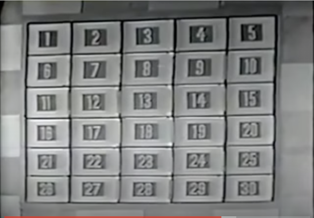
When the 1970’s syndicated version came out, the board got a garish new look:

Syndicated game board. Classic Concentration kept this color scheme, replacing the mechanical board with a computer generated one of 25 pieces

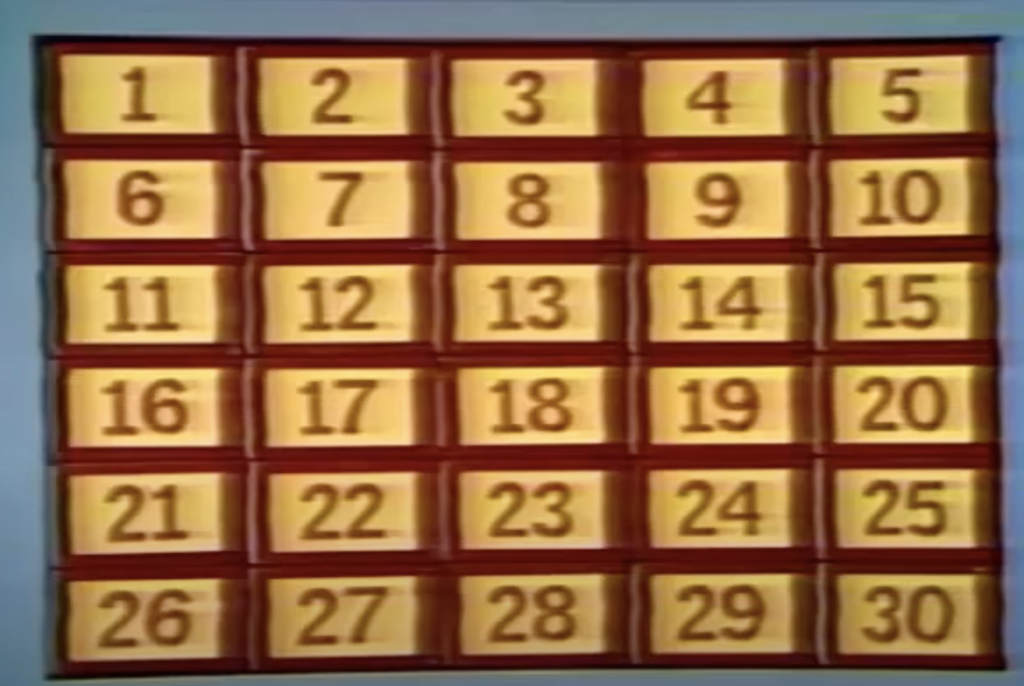
I just hated this look, and from the start, I decided my game would have a version of the original look.

And yet, since I was adding a preference for the sound, how hard would it be to add a preference to use this color scheme? Not very, it turns out, and with the power of Cascading Style Sheets (CSS), I could even have a cool transition between looks.

One thing I did pick up from the syndicated version was the colored puzzles. The original producer, Norm Blumenthal, refused to add color, as he felt it would make the puzzles too easy to guess, incurring displeasure from the network, which wanted to convert all its shows to color. He ended up compromising, making the puzzles pink on maroon. Personally, I think he was wrong — color can be used to misdirect as easily as it can give a puzzle away. When the show moved to Hollywood, the new producers had no compunctions about making the puzzles in color, and that’s how I’ve made my puzzles.

But then I got to thinking… CSS now has filters that can be used to alter the appearance of background images. If I combined a grayscale filter with an invert filter, maybe my color puzzles would look like the original Blumenthal style. I tried it, it’s not perfect, but it’s a decent approximation, so I added an option for that.

Adding options is good, but what’s the point of having options if you have to set them every time? (This is how “scope creep” happens, boys and girls). I added a LocalStorageService so that the user’s choices would be preserved, and a reset button to restore defaults.

There is also one more puzzle.

So what was intended to be an internal rewrite ended up being much bigger, adding the ability to play the sound of the trilons turning, and the ability to change how the puzzles and numbers look.

Take a look, and if you are so inclined, take a look at the source.

Tweaking the Theme

I’ve made a few small tweaks to the site theme.

When I first switched to this custom theme, responsive design was in its infancy, and neither the parent Twenty Twelve theme or my custom adaptation were designed for phones.

When I started using Jetpack on the site, it came with a mobile theme that I enabled. It looked very generic, but it also looked more presentable on mobile than the main theme… until a week or so ago.

Jetpack has given notice that they are retiring their mobile theme, so I decided to turn it off, to see how bad it was without it. Pretty bad. So I decided to turn Jetpack’s theme back on until I found time to deal with it… and found I couldn’t re-enable it. Oops. So, I’ve been chipping away at the issues for the past week or so, and now it’s pretty presentable on mobile.

The first thing I did was to override the fixed width on the content container. Here, I simply added a max-width to it, so that it wouldn’t get wider than the viewport. Next, I changed the way the background images are delivered — by default, the page only has background colors, and the “words” background image is only loaded for larger sizes. Next, I adjusted the positioning and sizing of the search field on mobile. Now, it’s small by default, then expands to cover the whole masthead. Finally, I adjusted the padding of the nav items so they all fit on a small screen.

I’ve also replaced a couple of the gradient images with linear gradients. I was using repeating background images for a couple of the gradients, to work around IE issues, and I really don’t care about IE anymore. I’ve also stripped out some vendor prefixes on some styles.

Update 2/29/2020

I’ve replaced the repeating “words” background image on the body element, so that I could also have a retina version for retina users. The words are mostly the same, in the interest of providing a text alternative, here they are:

<html> <head> <body> <nav> <img> <heading> <section> <div> <div> <span>


reading motorcycling New England diving photography kayaking Boston Charles River gardening bicycling Star Trek


document window Angular Observable function Array Event prototype Class string


aperture shutter lens ISO depth of field motion blur histogram exposure focal length strobe SLR f/stop


padding margin box-sizing flex color text-decoration background border top left

I’m not sure this theme is “worth” this effort. It’s just over 8 years old, which is ancient in web terms, but frankly, I still like the way it looks. And now, it looks like itself on mobile, too.

Subtle CSS Error

An exercise in debugging Cascading Style Sheets

We launched a new version of the work website this week. We’re still tweaking things, but overall, I like the look of it, especially the subpages. The report pages haven’t looked this good in ages. I think I’ve kind of fallen in love with Open Sans, the font used in the new design, and I like that it comes in both bold and semi bold versions.

Just before we launched, though, we ran into one of those wonderful head scratchers that seem to be the hallmark of web development. We were clicking through the various views, and Garry clicked into the screen to edit an address. In IE, (of course) there was nothing there except the Save button at the top of the page. Since the section is loaded via Ajax, my first thought was that it was some sort of problem with loader script, especially since I was seeing Javascript errors in the error console. I found that error, fixed it, but it still didn’t fix the page.

Brute Force Debugging

Obviously, since we were dealing with a new theme and a new style sheet, those could be the culprit. So was it the new HTML or the new CSS? Turning off CSS showed the form, but was that issue?  Nothing obvious leapt out at me, and I had no idea where to even start looking. Finally, I bit the bullet, saved a backup copy of the stylesheet, then deleted the last third of it. No luck. I reinstated the section I deleted, then deleted another section. Still no luck. Finally, removing lines 400 to 700 revealed the form. From there, it was a simple matter of removing smaller and smaller parts of the stylesheet, until we zeroed in on the offending line.

Here it is:

main .controlbar .minibutton, main .controlbar .minibuttonactive {width:auto; display:inline;  text-align:center;  margin: .07em 0 .34e7em}

Do you see it?

The problem arose out of the fact that, for accessibility’s sake, we’re using ems instead of pixels (px) as units of measurement, because they make it much easier for a user to resize their screen. Pixels tend to be simple integers; ems are often decimals, and in a longish decimal, a typo can hide. In this case, the margin should be

margin: .07em 0 .347em

Once I narrowed into the right line, it was immediately obvious. Nearly an hour to find, 10 seconds to fix.

New Year, New Look

Just in time for the new year, I’ve revamped the appearance of the site. This is something I’ve been wanting to do since I first set up the site, but I had the notion that I needed to create a whole new theme, and was very slowly working my way through a WordPress book.

As it turns out, that wasn’t necessary. WordPress supports child themes–it isn’t necessary to create a whole new theme, you can simply override the parts of an existing theme that you want to. In this case, I’m basing my theme on the default TwentyEleven theme I was already using.

I’d fallen in love with the theme’s header image feature, and had already created some really nice banners from some of my pictures. But I wanted more color, I wanted to play with web fonts, and I wanted an appearance that was mine.

Typography

The fonts I’m now using are Museo Slab for the titles and Museo Sans for the main body text. Right now, I’m using TypeKit to provide them. One thing I’m less than crazy about is that you need to add a script to bring them in, and they’re hosted by TypeKit. I need to look into self-hosting them.

Backgrounds

The main blue background is a PNG gradient applied to the HTML (root) element, with the “words” as a repeating PNG image applied to the BODY element. I’m of two minds about this background, from an accessibility standpoint. On the one hand, they’re meant to denote some of my interests, which would indicate that that some programmatically determinable method should be available. On the other hand, they’re meant to be decorative and kind of subliminal, and not to be really read. They’re not in a meaningful order, and in fact, you can’t see them all. They’re almost just texture. In the end, this is the line of thought I’ve followed.

The other gradients are created via CSS, using code based on ColorZilla’s Ultimate CSS Gradient Generator.

HTML Changes

Most of the generated HTML is still straight TwentyEleven. During development, I had to replace the stylesheet link with a hard coded link to my development site– WordPress is absolutely bloody-minded about using absolute links, which makes things needlessly complicated when you’re developing on a development domain. The one HTML change I’ve made so far is to add a little markup to facilitate the “posted on” calendar, which I implemented via a filter in my child theme.

One other change I want to implement in the future (hopefully, near future) is to provide alternative text for the header image. Surprisingly, the stock theme only provides an empty alt attribute with no easy way to add alternative text, and from what little I saw on the support forums last night, this was a design decision–I gather the feeling is that they regard the header image as being strictly decorative, and want to head off keyword stuffing. I can see that, but I can also see a site creating header images that include text, which would need alternative text. In my case, I’d like to add alternative text indicating what the header is a picture of, and it would even be nice to add a little visible caption with that information.

Browser Support

The site looks great in Safari, Opera, Chrome, and current Mozilla browsers like Firefox or Camino. I’ve looked at it in IE 7 and 8, and it looks good in those browsers too, though it’s missing some of the niceties like text embossing and rounded corners.  I haven’t seen it yet in IE 9. I am aware of an issue in older Mozilla browsers — the typography is missing, as is the gray background at the top, due to a bug in the way those browsers dealt with unknown elements. (The site uses some of the new HTML 5 features). The site is still readable, though, and the work-around– serving the site to Mozilla as text/xml– is risky, since one misplaced entity or malformed comment or post would blow the page out of the water. In the end, I’ve decided to accept that older Gecko based browsers won’t see as nice a presentation of the site. Fortunately, usage of these browsers is well under 1%.

Update 1/4/12:

I’ve now seen it in IE 9, and of course, IE Is Being IE. Earlier versions of Internet Explorer don’t support rounded corners, but IE 9 does. Unfortunately, since I was using an IE filter style to provide the top gray gradient, there were square corners poking out of the header. Apparently, it can’t clip the rounded corners when using older filter styles. I’ve replaced that gradient with an image; which took care of the problem.

Future Plans

As I stated above, I’d like to add alternative text/captioning to the header images, and I may add a little control to the home page enabling the user so rotate through the images without reloading the page. I also need to look into a widget to display tweets (I’m @ShutterAperture on Twitter). I will be adding an About page, and uploading and providing links to some of my older static pages that I was hosting either on Comcast when I was using them, or MobileMe. And in two weeks, I’ll be heading to Bonaire for a week of diving, and am looking forward to blogging about that.

Happy New Year, everyone.