My cousin Susan was the first grandchild in the family; the daughter of my Uncle Billy and my Aunt Dot. Billy died young, leaving Dot a widow with three young daughters.
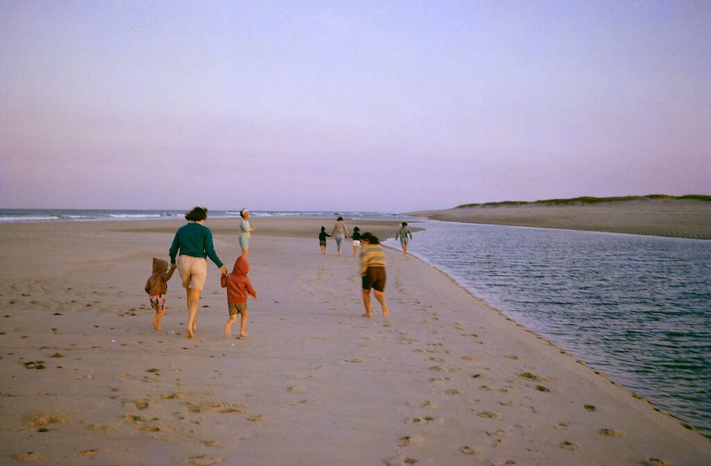
It seemed for a while like the three of them were around a lot; my Dad became a surrogate father for them before he married, and even afterwards, we saw a lot of them when we visited my grandmother, and they came fairly often to the house. I remember her staying over one summer evening and sleeping out on the cot on the porch, and distantly remember, perhaps aided by photographs, of being with them on the Cape, and seeing a shipwreck buried in the sand.
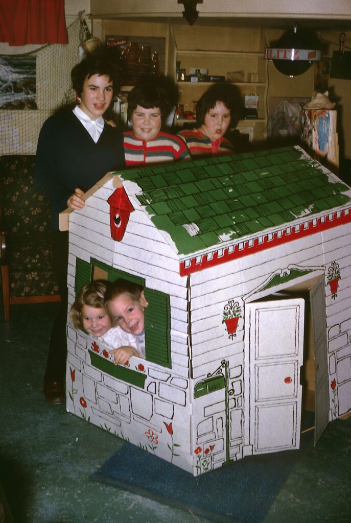
Susan and her sisters at our house, behind a toy house with my sister and I in it.Susan and her sisters with us
All three girls were older than me, with Susan being very much older, there being about eight years between us, which is an eternity when you’re six.
This Christmastime marks the 60th anniversary of her death. All three girls were fond of horses, but in December of 1965, Susan was either thrown from or fell off her horse. At first she shrugged it off, but after a few hours, her mother noticed was something seriously wrong, and got her to the hospital.
I don’t know the exact details of her injury, whether it was a bad concussion or whether a skull fracture was involved. I do know she lingered, I believe in a coma, over the Christmas holiday while the whole family held its breath and prayed for her.
My mother often told us the story at Christmas of how she went to Midnight Mass that year, and started sobbing uncontrollably when the children’s choir started singing, to the extent that her father had to hold her tight.
Susan finally died December 28, The Feast of the Holy Innocents in the Catholic calendar. She was just 14, Dot was devastated of course, and her death created an additional hole in the extended O’Hara family; what once had been a threesome was now two, with one member always missing. And of the over two dozen cousins of my generation, only a few of us are old enough to remember her; I’m the only one of my own siblings old enough to remember her, and most of my cousins are younger, But those of us who do, remember her fondly.
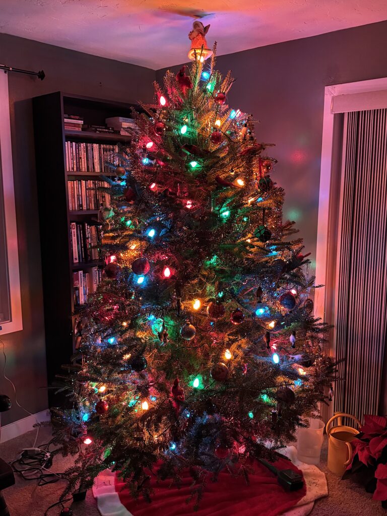
Thirteen years ago, in Season of Lights, I mentioned that the then-new light emitting diode (LED) Christmas lights were not to my taste – “the newer LED lights seem to be too heavy on the blues. Their blue lamps are quite bright, and their oranges and reds less bright in comparison” Alec Watson of the Technology Connections YouTube channel felt the same way; for the better part of the last decade he has published videos complaining about spectral colored Christmas lights and how he has tried to reproduce the look of older lights.
Personally, I don’t object to the brilliant blues the way Watson does; I think the problem with first generation LED lights (which unfortunately are still around) is that the red and orange lights are deficient. They’re nowhere near as bright as the blue or green lights, and so the string as a whole feels unbalanced. Over the past couple of years, I’ve seen lights, which, while they still have the tell-tale brilliant LED blues, have orange and red (and white and sometimes purple) lights which are bright enough to balance the blues. I just got back from a drive around Boston Common, and am happy to say that the official Boston Christmas tree is lit this way, and there are several houses nearby that also use these better-balanced light strings.
Even better, there are now LED light bulbs expressly designed to emulate the warm look of incandescent lights. A couple of years ago, Technology Connections did a video about the new Tru-Tone bulbs. He was positively giddy about them. I was interested, but they were sold out last year.
I was still interested this year, so this October I decided to buy them before they sold out. I bit the bullet and ordered five 25 C-7 bulb strings and enough lights to fill them. I chose not to order the complete sets, as I don’t care for white bulbs mixed with colors. I was really hesitant because they’re really pricey, but dammit, they do look just like the Christmas lights I grew up with, but without the heat or electrical demand. So here I sit, next to my tree, basking in the warm glow of its lights.
Unlike last year, I didn’t have a pre-conceived idea of what this year’s Christmas Card would be. I generally start scanning my photo library around Thanksgiving, but the cupboard was coming up bare. I started to think maybe I’d go into Boston over the weekend after Thanksgiving to see if I could take a picture of lights that spoke to me.
And then I went to Polillio’s in Stoughton to pick up a wreath and kissing ball for the front door and steps. They’re a garden center that I used to use a lot before I moved to the condo, and they always have a lot of Christmas decorations on display around this time of year, so I had my eyes out for something I could photograph.
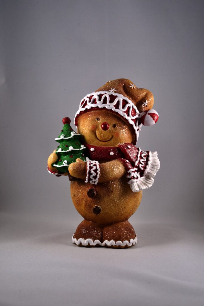
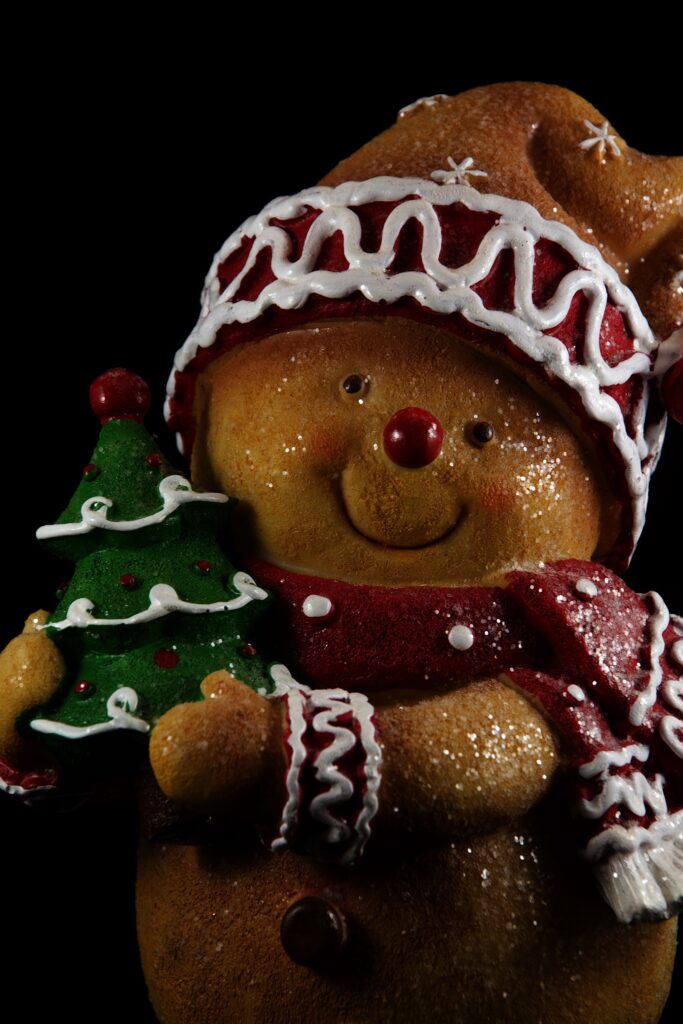
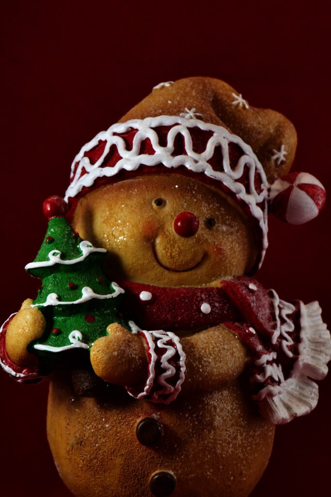
And then I saw it — a ceramic figurine of a teddy bear in a Santa hat holding a Christmas tree. It was cute, and I figured “A picture of a teddy bear from Ted… why not?” So I picked it up, and set up the table top studio.
The “studio” was a Christmas present from my mother from about a decade ago. It’s a small lightbox about 16 inches cubed, with a pair of lights. It came with white, red, blue and black backgrounds that attach to the back of the lightbox with velcro. I first used it for my 2016 card of the snowglobe. It almost didn’t make the move here, because I’d broken one of the lamps while shooting my 2021 gingerbread house card and hadn’t been able to find an exact replacement bulb. I was originally going to toss it when we cleaned out the old house, but in the end, I brought it over, and I decided to replace the broken halogen bulb and its remaining twin with an LED bulb that turned out to be both brighter and less hot. It was rated as a 5000°K bulb, and the color temperature turned out to be pretty reasonable, and easily adjusted in Photos.
I set the studio up in the dining area, and put the teddy bear in it. I decided to try shots with the white, red, and black backgrounds. For the first set of pictures, I tried all three of my lenses. I knew I wanted to shoot it from the bear’s eye level, and originally envisioned it as a full length picture with open space all around it, and some extra space above for the text. I shot 28 variations, against white, red, then black, and then transferred the results to the computer for a look.
Re-creation of studio set-up
I frankly wasn’t thrilled with any of them. The composition was a little too on the nose. I did decide that I liked the red background, and since I knew I’d just picked up ink, I could afford to print a picture with a lot of red. On the other hand, I didn’t care for the composition of any of the red pictures.
The very last picture I shot, though, had possibilities. I was shooting against the black background, and since I knew I probably wasn’t going to use it, I was a little freer with the composition. I came in tighter, and framed him mid torso up. I didn’t care for the background, but I did like the composition. So I decided to shoot another batch.
Since I had a better idea of how I was going to frame them, I switched to my 105mm macro lens. It’s a fixed focus lens, and is sharpest lens I have. I found for this second session that placement of the lights made a difference — the bear is lightly covered in glitter, and the position of the lights controlled how they would catch the light, as well as the play of the highlights and shadows on the bear itself. I shot 11 variations, and they were better, but still a little flat. Also, in several of the pictures, the glitter next to the bear’s left eye was catching the light strangely. I realized the bear was turned so that the side with the Christmas tree was turned slightly away, and that it should be turned so that the tree side was slightly closer, almost as if he were presenting the tree to the viewer. So I shot one more batch, and this time, I got what I was looking for.
I’d done the kind of normal corrections I do for any photo. All my Christmas card photos up to this point had required some sort of Photoshop (or equivalent) work, but when I brought this one into Photoshop, I looked at it and said, “Nope. It’s fine”. This was the first time; all the work was done in-camera, in the framing and lighting.
Next, it was time to manufacture the cards. I duplicated last year’s card files, which had both the inside and outside in them, and replaced the images with the new ones. For the flyleaf, I chose one of the pictures from the balloon flight and another from the train trip in the White Mountains in October. Early versions of the card also had a picture of fall foliage on the Charles River and sunrise at Nantasket, but they made it seem a little crowded, so I dropped them.
I had a shock when it came to print them. Last year I’d been able to successfully print the cards two-sided, which was great since I didn’t need to run the cards through the printer twice, and worry about getting the orientation of the outside and inside correct. This year, for some reason, it kept jamming on me when I tried printing two-sided. Worse, the computer kept forgetting settings between runs. It kept resetting back to two-sided printing, or would revert to normal quality. And since I’d laid it out with a two sided layout, I had to make sure I was correctly selecting the proper pages. The final insult came when I ran a head cleaning cycle on it; cards often print a little bandy, but they were much improved after head cleaning, but unfortunately, but that point, I’d already done most of the cards.