New Year, New Look

Just in time for the new year, I’ve revamped the appearance of the site. This is something I’ve been wanting to do since I first set up the site, but I had the notion that I needed to create a whole new theme, and was very slowly working my way through a WordPress book.

As it turns out, that wasn’t necessary. WordPress supports child themes–it isn’t necessary to create a whole new theme, you can simply override the parts of an existing theme that you want to. In this case, I’m basing my theme on the default TwentyEleven theme I was already using.

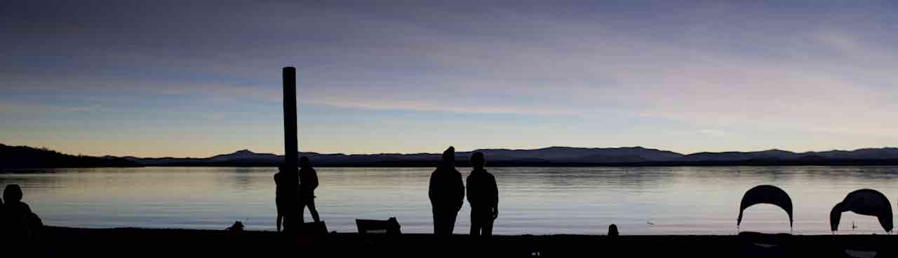
I’d fallen in love with the theme’s header image feature, and had already created some really nice banners from some of my pictures. But I wanted more color, I wanted to play with web fonts, and I wanted an appearance that was mine.

Typography

The fonts I’m now using are Museo Slab for the titles and Museo Sans for the main body text. Right now, I’m using TypeKit to provide them. One thing I’m less than crazy about is that you need to add a script to bring them in, and they’re hosted by TypeKit. I need to look into self-hosting them.

Backgrounds

The main blue background is a PNG gradient applied to the HTML (root) element, with the “words” as a repeating PNG image applied to the BODY element. I’m of two minds about this background, from an accessibility standpoint. On the one hand, they’re meant to denote some of my interests, which would indicate that that some programmatically determinable method should be available. On the other hand, they’re meant to be decorative and kind of subliminal, and not to be really read. They’re not in a meaningful order, and in fact, you can’t see them all. They’re almost just texture. In the end, this is the line of thought I’ve followed.

The other gradients are created via CSS, using code based on ColorZilla’s Ultimate CSS Gradient Generator.

HTML Changes

Most of the generated HTML is still straight TwentyEleven. During development, I had to replace the stylesheet link with a hard coded link to my development site– WordPress is absolutely bloody-minded about using absolute links, which makes things needlessly complicated when you’re developing on a development domain. The one HTML change I’ve made so far is to add a little markup to facilitate the “posted on” calendar, which I implemented via a filter in my child theme.

One other change I want to implement in the future (hopefully, near future) is to provide alternative text for the header image. Surprisingly, the stock theme only provides an empty alt attribute with no easy way to add alternative text, and from what little I saw on the support forums last night, this was a design decision–I gather the feeling is that they regard the header image as being strictly decorative, and want to head off keyword stuffing. I can see that, but I can also see a site creating header images that include text, which would need alternative text. In my case, I’d like to add alternative text indicating what the header is a picture of, and it would even be nice to add a little visible caption with that information.

Browser Support

The site looks great in Safari, Opera, Chrome, and current Mozilla browsers like Firefox or Camino. I’ve looked at it in IE 7 and 8, and it looks good in those browsers too, though it’s missing some of the niceties like text embossing and rounded corners.  I haven’t seen it yet in IE 9. I am aware of an issue in older Mozilla browsers — the typography is missing, as is the gray background at the top, due to a bug in the way those browsers dealt with unknown elements. (The site uses some of the new HTML 5 features). The site is still readable, though, and the work-around– serving the site to Mozilla as text/xml– is risky, since one misplaced entity or malformed comment or post would blow the page out of the water. In the end, I’ve decided to accept that older Gecko based browsers won’t see as nice a presentation of the site. Fortunately, usage of these browsers is well under 1%.

Update 1/4/12:

I’ve now seen it in IE 9, and of course, IE Is Being IE. Earlier versions of Internet Explorer don’t support rounded corners, but IE 9 does. Unfortunately, since I was using an IE filter style to provide the top gray gradient, there were square corners poking out of the header. Apparently, it can’t clip the rounded corners when using older filter styles. I’ve replaced that gradient with an image; which took care of the problem.

Future Plans

As I stated above, I’d like to add alternative text/captioning to the header images, and I may add a little control to the home page enabling the user so rotate through the images without reloading the page. I also need to look into a widget to display tweets (I’m @ShutterAperture on Twitter). I will be adding an About page, and uploading and providing links to some of my older static pages that I was hosting either on Comcast when I was using them, or MobileMe. And in two weeks, I’ll be heading to Bonaire for a week of diving, and am looking forward to blogging about that.

Happy New Year, everyone.


Happy Merry Christmas Holidays

So, it’s that time of year.

Actually, for some reason, I’m way ahead of schedule, which feels weird… and a little unsettling. I got the cards out a few days earlier than I normally do, and aside from gift cards and stocking stuffers, all my presents have been gotten and wrapped. I keep wondering what I’ve forgotten.

A “Holiday” Tree?

Rockport Christmas tree
Christmas tree, Rockport, MA

There was a bit of an uproar this year in Providence when the mayor insisted on lighting the official “Holiday Tree.” It seems to me there’s enough stupidity on both sides that I had to say something.

First of all, as a general matter, I can’t get worked up about a “war on Christmas”. I’m not religious, but I do enjoy the secular parts of the holiday. Vienna Teng has a wonderful song on Warm Strangers called “The Atheist’s Christmas Carol” which is pretty apt. On the other hand, there are people who don’t observe it, or who observe other holidays, and I see no harm in using a more general greeting if you don’t know enough about the other person to be sure they celebrate Christmas. I make my own Christmas cards, and I usually have two versions of the card—one that says “Merry Christmas”, which goes out to most people on my list, and one that says “Happy Holidays” or “Season’s Greetings”  that I send to people I’m either not sure about, or who I know don’t celebrate Christmas.

That said, I think it’s disingenuous to be referring to a “Holiday Tree”. Trees just aren’t part of Hanukkah. The Christmas tree is a distinctive part of the current day Christmas celebration, and to call it something more generic, isn’t being respectful of other traditions, it’s just being politically correct. In fact, I wonder if it’s disrespectful: disrespectful of Christians, who feel their traditions are not being recognized, and disrespectful to Jewish people, who sometimes feel they have to fend off the “Christmas-ization” of Hanukkah.

For what it’s worth, our own Christmas tree gets decorated tonight.

Christmas Season Bike Ride

One personal annual tradition I’ve observed sporadically is a bike ride along the Minuteman Bike Path during the Christmas season. I started it by accident, one Sunday in December several years ago, when I stupidly forgot that the sun sets around four in December, and didn’t leave the house until around 2:30. By the time I reached Bedford, and was heading back, it was already getting dark…and found to my delight there were Christmas lights at several points along the path. It’s a hard thing to time right — one year I started about half hour too early, and didn’t see anything.

This year, I seemed to hit it right, but there weren’t many lights as I remembered, and I froze my feet off. So much for that annual tradition…

Canon PowerShot G12

I just picked up a replacement for the old Canon Powershot S70 I’ve been using mostly underwater. It’s not really the best time for me to be buying a camera, but I’ve been noticing for a while that the pictures it takes above water have been very unsharp, and I want something I can trust in Bonaire. I bought it off of eBay for about $200, and repairing it is probably not cost effective. I’m still getting used to the new camera and haven’t even taken the housing out of the box yet.

Most of the major functions, at least, most of the ones that I care about, I was able to figure out just by noodling around with it. But it’s definitely a good example of both the good and bad sides of Japanese design. After using the iPhone and iPad, it’s really noticeable.

On the pro side, the picture quality is very good, and the camera feels solid. Because it’s a prosumer camera, there are separate dials for exposure compensation, shooting mode and ISO. On the con side, I would quibble with the placement of some of the controls — the zoom lever feels awkward to me, for example.

A bigger problem is that it feels like there are a lot of features and modes that are there to be a checkmark on a feature list, not to be useful. This thing actually has a mode to automatically shoot when it detects a smile, for example. I am not making it up, it really does. But to put it in that mode, you have to set the mode dial to scene mode, press the function button, scroll through a bunch of shooting modes (to give them credit, it does have help text), press the function button again, then press the DISP button to choose which of the smart shutter mode you want.

I worked my way through the manual (provided as a pdf, not a physical booklet) and there’s a lot of stuff that might look good on a feature comparison chart, but which I can’t see myself using, either because the feature is too cumbersome, or the feature is too esoteric, or provides an effect I don’t care about, or would prefer to do on the computer. There are several special effects settings that fall under this category, such as color replacement, which I would prefer to do as post-processing. And some of the special modes are just head scratchers… a special mode to make your scene look like it’s a miniature? Really??? (Yes, really.)

By way of contrast, the Apple design ethic calls for fewer features, fewer discrete modes, but more polish on the features that are provided. Had Apple designed it, there definitely would be less flexibility, fewer half-assed shooting modes, and those that were implemented wouldn’t need a long series of key presses. They’d probably also get rid of a lot of the physical button in favor of a touch screen… which is probably not so good for a camera which is supposed to be used inside a housing.

Still, I have to say I’m looking forward to seeing what I can do underwater with this. I took it out for a spin on Saturday up to Cape Ann, and it was very fast, and the picture quality is good:

Singing Beach, Manchester, MA

Singing Beach, Manchester, MA, taken with the Canon PowerShot G12

Opposite side of Singing Beach

Opposite side of Singing Beach, Manchester, MA, taken with the Canon PowerShot G 12

Features vs Quality

Yesterday’s motorcycle ride reminded me once again that sometimes quality is better than a whole bunch of features, and that fit counts.

Late in the summer, I bought the Scorpion EXO 900 helmet. It’s a modular helmet that allows you to flip up the chin bar– in fact, you can even take it off, and use it as a three quarter helmet. I’ve been wanting a modular helmet since the last time I took the camera with me and had to take the helmet off every time I stopped to take a picture. In the store, I fell in love with the retractable sun shield, and allowed myself to be talked into a snugger fit, on the theory that it will only get looser, and you want a snug fit.

For me, though, it’s turned into one uncomfortable helmet. It’s heavy, and after a while, the weight gets to you. And the tightness around the ear pads gets to me after awhile. It just doesn’t feel good after awhile. It sort of reminds my of my first helmet, a Bell, that wasn’t very comfortable either.

This was borne home to me yesterday when I wore my old Shoei. It’s not modular, but it’s light, and comfortable, and it felt so good. I could have ridden even further if I hadn’t been anxious to get a bicycle ride in.

I’ll probably keep the Scorpion around for rides when I think I’ll need the modularity, but will stick to the Shoei or Arai for most of my riding.

Warm December

The unseasonably warm weather continued today. With a high around 54°, it felt more like October. I took the motorcycle out along Route 109 to 27 to  Route 16, past the Weston Ski Track, where they weren’t making snow yet, to Route 30 and back.

I then loaded the bicycle into the car, and took a ride along the Charles. My legs have been stiff and sore lately, so at the start of the ride, I wasn’t sure how far I could ride, but by the time I hit the Mass Ave Bridge, things had loosened up nicely, and I ended up going as far as the North Harvard Street bridge.

Boathouse Boathouse on the Cambridge side of the river, taken near sunset

It was beautiful around the river, but the earliness of the sunset was a reminder that it really is December. I’m wondering how long it will be before the weather catches up.