I’ve been making my own Christmas cards since 1997, but my 2013 card was the first card I documented here on the blog, and it started an annual tradition I’ve kept up each year since.
There were a couple of reasons I started posting with that card. First, the blog was relatively new at that point. More importantly, that card was a particularly difficult one; I still remember the feeling of being completely stumped for days regarding the subject matter, and the difficulties I had trying to execute the idea once I came up with it, and how ultimately, it came out much better than I hoped for. So I posted about it, patterning the title based on Theodore White’s The Making of the President 19xx series. And I’ve been writing about each card since.
That card had 14 predecessors, though, and I thought it might be fun to look back at them and describe how they came about.
Complicating matters is the passage of time. I don’t remember all the details of what I did, and I also used software that I no longer have — Apple’s software updates tend to break software. I was big into Painter when I started — first by Fractal Design, and later, Corel, and laid the cards out with Adobe Illustrator. Painter allows you to emulate the effect of various natural painting media: watercolors, oil paint, and natural painting styles. It was a lot of fun, but I never really used all its potential, partly because I couldn’t think of stuff I wanted to paint. As for Illustrator, I enjoyed noodling around with it, but when it broke under later system software, I couldn’t justify spending the money for a dedicated subscription for it. If Adobe offered a special Photoshop/Illustrator bundle, I’d probably go for it.
I’ve kept my old 2001 PowerMac G4, though, and can access most of the old files. Hopefully, I can access enough to give you an idea of how they looked.
1997: Rock Beauty
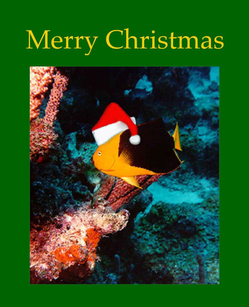
In March of 1997, I took my first tropical dive trip, to Curaçao. It was a group trip through East Coast Divers, and I greatly enjoyed it, both the diving and the company of the others on the trip. I don’t remember the details, but I got a picture of a rock beauty, which is a yellow and black angelfish. I’m not sure how I got it; this was before I had my underwater cameras, though I do remember renting a Nikonos underwater camera for a day, though I recall that I was shooting slide film. Or maybe it’s just a picture I found online.
Anyway, I was feeling friendly towards my traveling companions, and thought it would be amusing to take this fish picture, and put a Santa hat on it, to create a scuba-themed Christmas card I could send to folks. I don’t think it was my intention to start a Christmas tradition that’s now lasted for decades.
I’m quite sure I used Painter to add the hat, and then used AppleWorks (another program that’s fallen by the wayside) to lay out the card.
1999: Kitten in a Stocking
I think this card was an example of having an idea that I wasn’t quite up to executing, and swotting away at it until I got something passable.
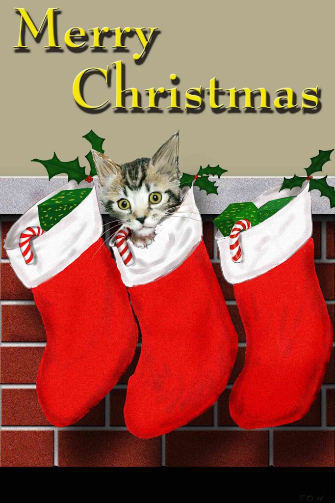
The basic idea was to have a set of stockings hanging by a chimney, with a kitten peeking out of one of them. It was mostly constructed in Fractal Design Painter. I seem to vaguely recall starting this in the 1998 season, and not being able to pull it off in time. If so, I didn’t feel the urgency then to get something out.
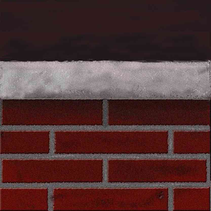
The first step was to construct the fireplace behind the stockings. I kind of remember creating the bricks in Painter. I think I used one of the spray paint tools to create the brick texture, though I might have done it by applying a Noise filter. I remember being pleased with the bricks when they were done.
The next step was to add the stockings. They’re clearly painted, not photos. I probably used one or more of the oil paint brushes.
The final step was to add the kitten, and tie it into the stockings. I have a couple of early versions where I was trying to draw a kitten, but I don’t remember if these were actual attempts or just for placement.
(Aside –my early work is more apt to be saved in several different version numbered files. Nowadays, working in Photoshop, I’m more likely to use layers, and either delete experiments, or just turn the layer off).
In any case, I eventually realized I needed to use an actual kitten, I probably found the kitten online, and punched it out of its background — clumsily by current standards. The matte line around it is pretty apparent. I then took the kitten and got it into the main painting sticking out of the center stocking.
From there, I took the painting into Illustrator to apply the text and lay it out into a box on the page. Up until recently, I used to create two versions — one, saying “Merry Christmas” for those people I knew celebrated Christmas, and a “Season’s Greetings” or “Happy Holidays” version for those I was less sure of.
2000 – La Salette
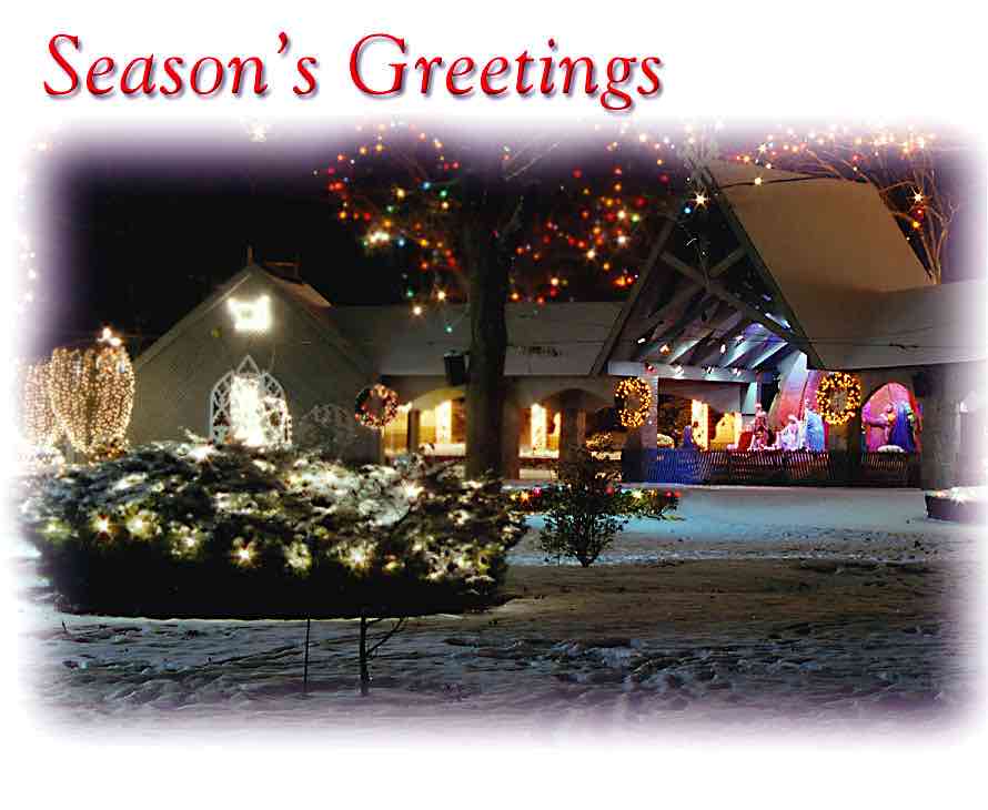
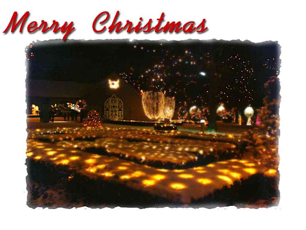
I would say 2000 is the first year I definitely felt that Christmas Cards were something I needed to do. I was working in Providence by then, so one evening in early December, after a light snow, I visited the La Salette Shrine in Attleboro to see if I could get a picture I could use.
I actually got a couple of usable pictures, and to be honest, I’m not sure which one I used, or if I used both. One was a picture of a Christmas stable, and the other a picture of a large arrangement of candles. I sort of remember having to remove a trash barrel from one of them, though there’s nothing in the files I have now to indicate which one it was.
Side note — being able to work with a snowy original picture is often not the case. Christmas cards have to be mailed by the 16th of December or so to have a hope of reaching recipients before the holiday, and here in the Boston area, we don’t always have snow on the ground by then.
2001 – House Drawing
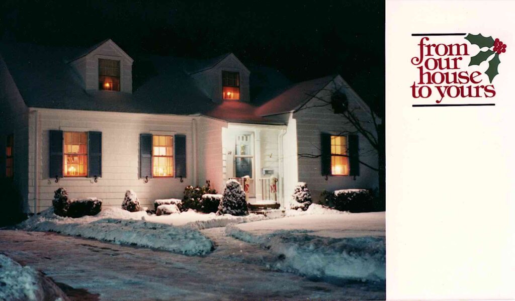
At some point in the mid 1980’s I took a picture of the house at night during one of the years when we had snow at Christmas. The window lights and front door light was on, illuminating the snow.
I worked for a one hour photo lab in the 80s and 90s, and when we got a Christmas card attachment for the printer, I used my own photos to create sample cards, one of the samples was this picture, which Mum loved.
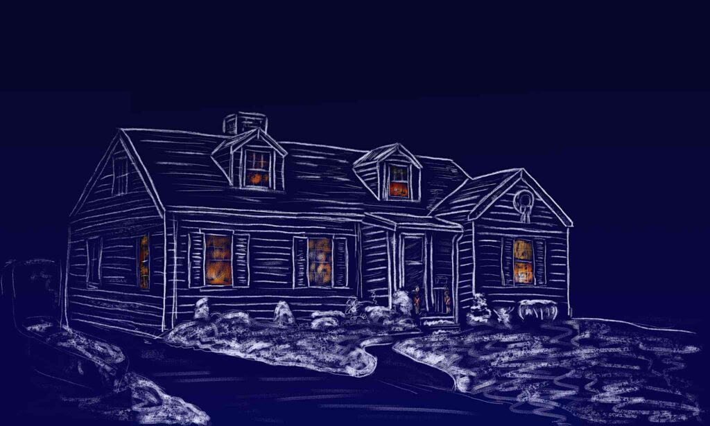
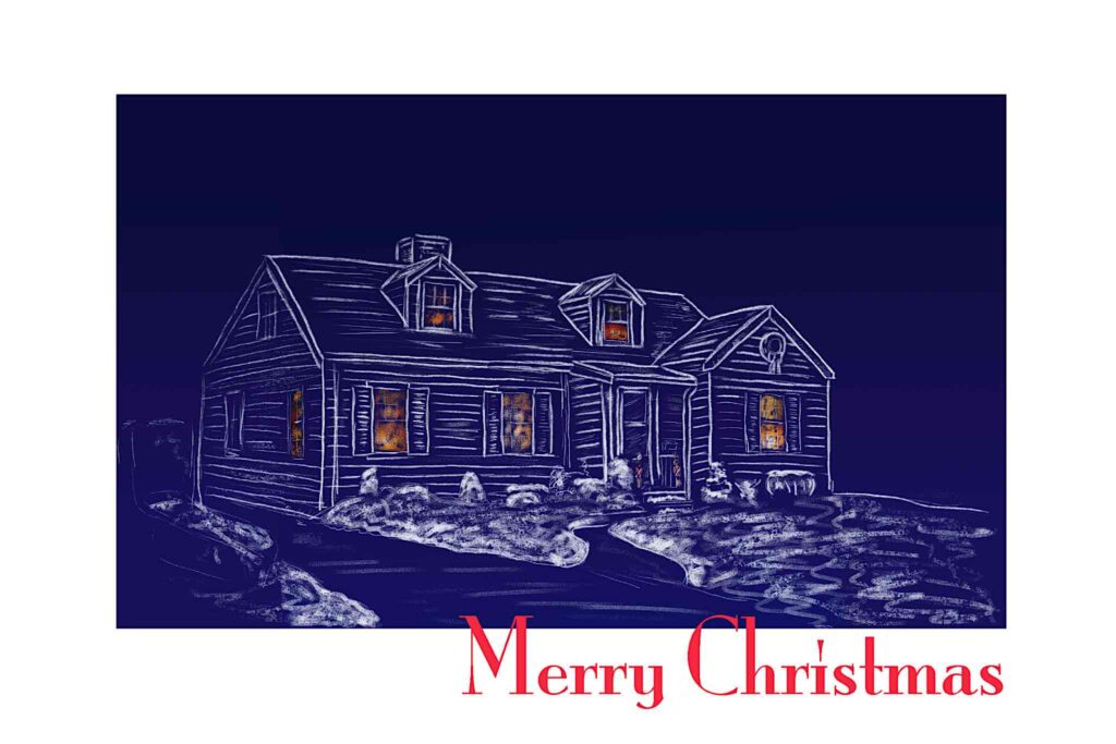
For 2001, I decided to create a digitally drawn version of this picture. Painter allowed you to bring in a picture to use as a source layer; you could essentially trace from the source onto the active layer. For this card, I decided on a deep blue, dusky background, with the outlines of the house drawn with white digital chalk, with the window lights in orange “chalk”. I don’t recall this card being particularly troublesome; just a bit tedious, since the whole thing had to be traced out.
2002: Angel
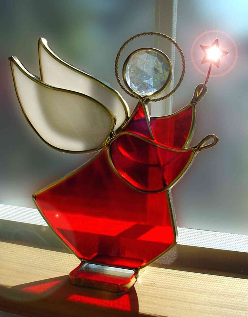
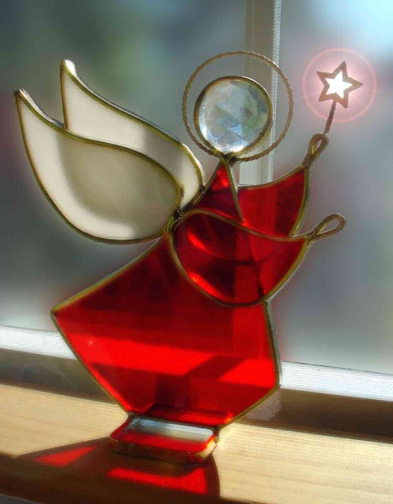
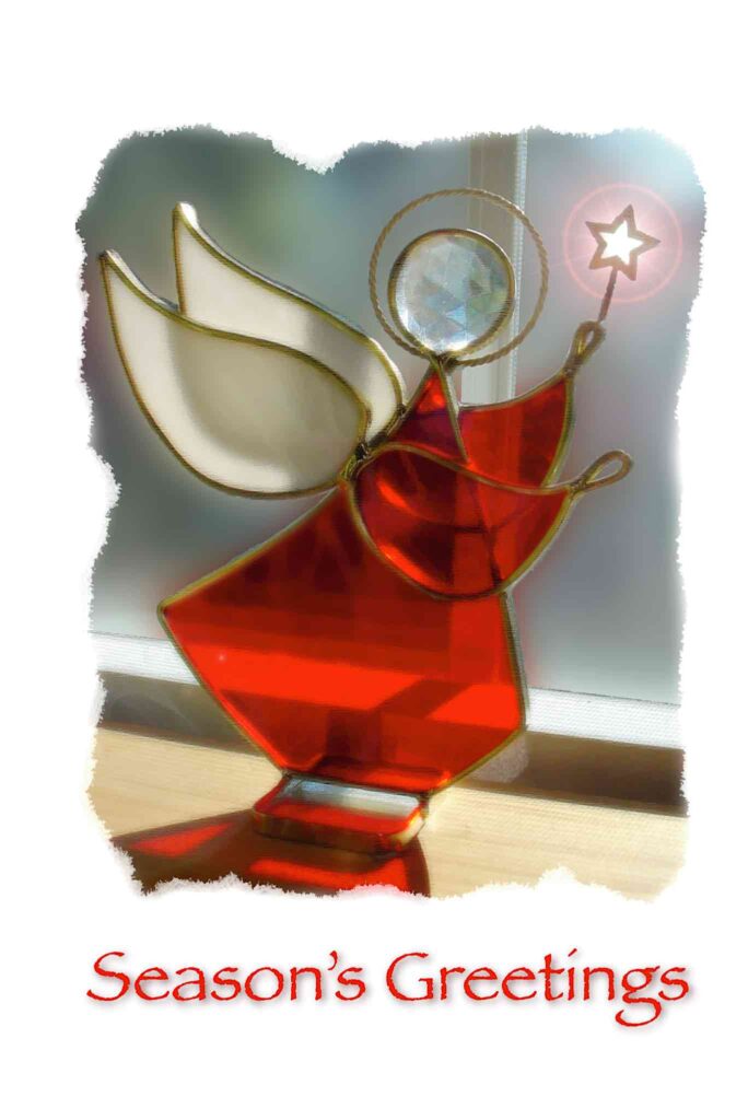
I would say this card is my first card of wholly digital origin. I’d gotten my first digital camera the year before, and took a picture of an Angel ornament my mother had standing on a shelf in the dining room.
I took the picture into Photoshop, added a lens flare around the wand the angel was holding, then a blur layer over the whole thing to make it look softer. One problem with home-printed cards to this day is that you can’t print to the edge of the card, so for this card, I added a rough-edged mask to the sides so that that the edges of the photo would be less apparent.
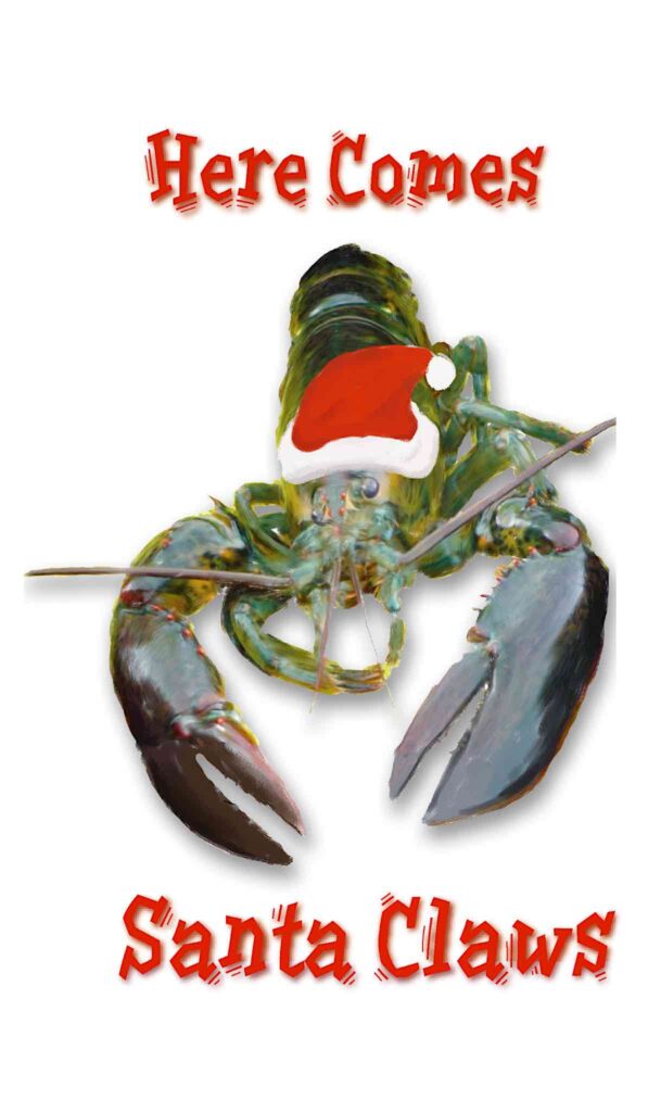
This year I actually did a second card, specially for my dive buddy. I took a picture I’d shot of a lobster in his catch bag, masked the background, and added a Santa hat, and the text “Here Comes Santa Claws”
2003: Toy Soldier
My aunt got us a pair of large plastic toy soldiers back in the mid seventies. Over the years, they’d gotten rather faded looking, and so, at some point, I repainted them. They were the first piece of really clean spray paint work I’d done.
For this year’s card, I shot several pictures of the soldiers in front of the Christmas tree, both before and after decorating it. I shot versions with both soldiers and a version with a single soldier. I ended up using a post-decoration shot of a single soldier. I then took it into Photoshop and Painter; I separated the soldier out from the background, then “spray painted” some of the background back in, so that it would fade in from the white card background.
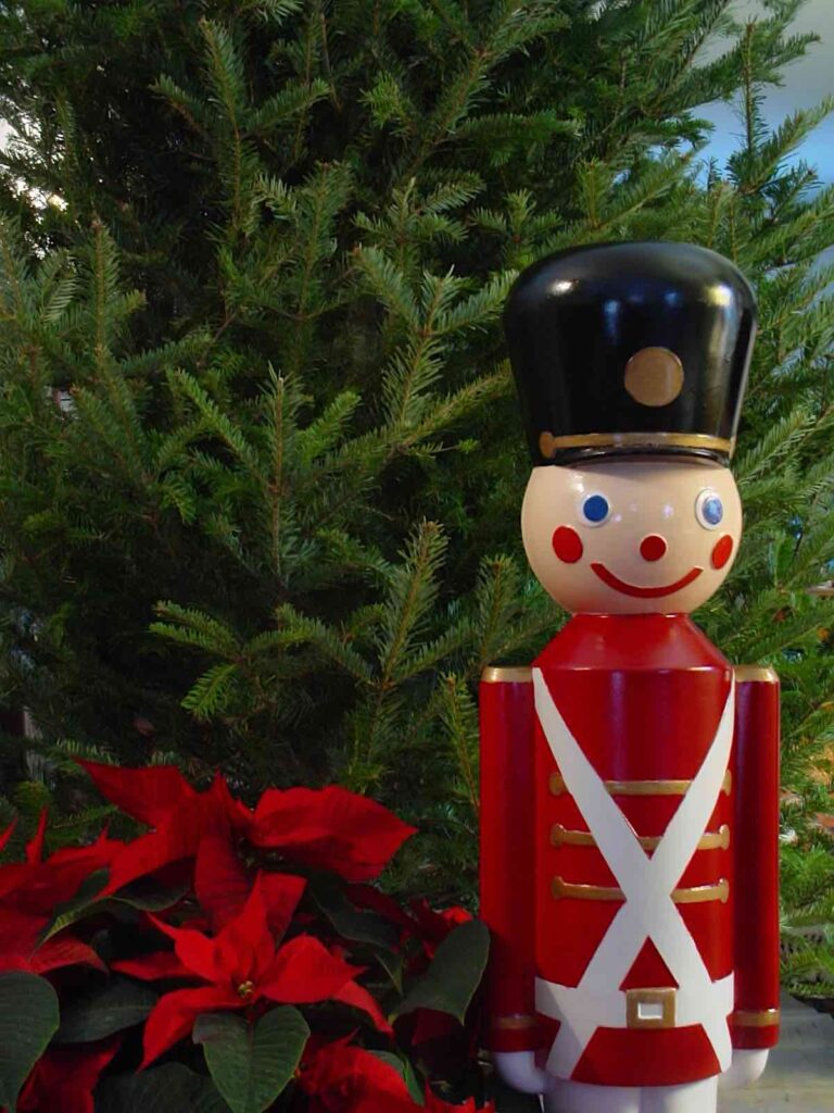
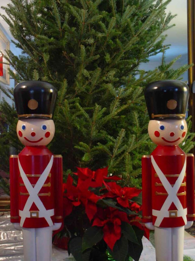
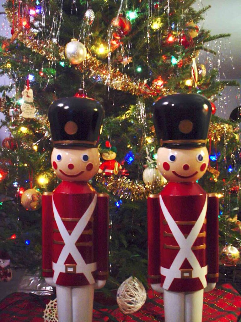
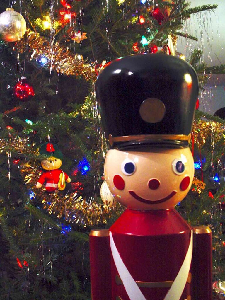
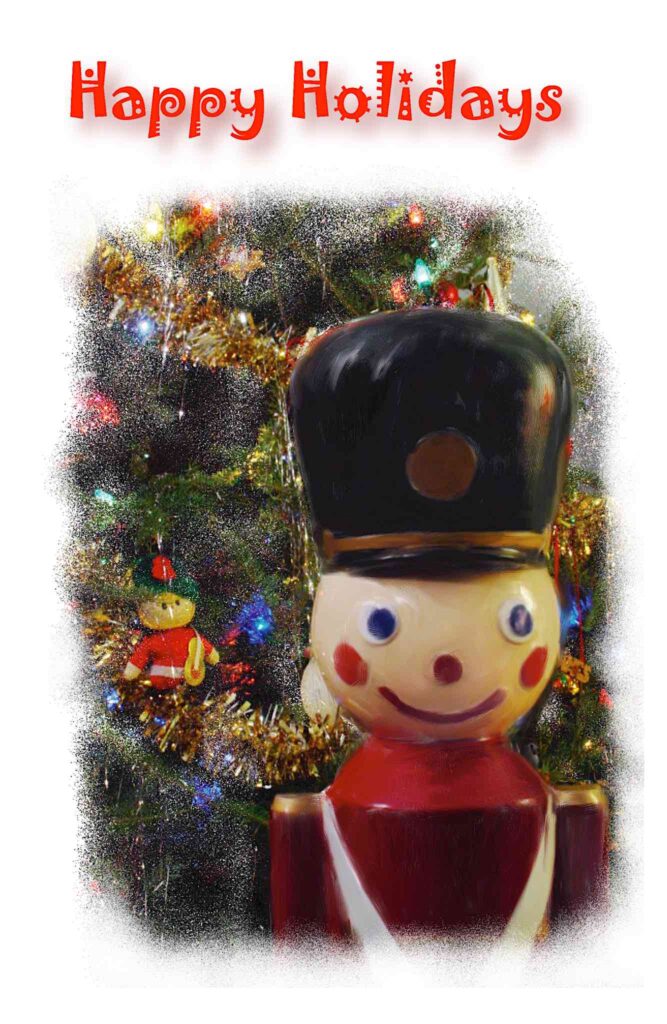
In hindsight, I probably should have played the background straighter and possibly gone with one of the shots of both soldiers.
2004: Motif #1
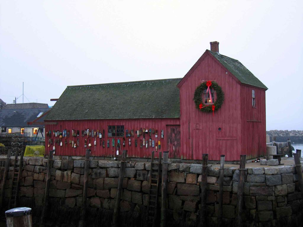
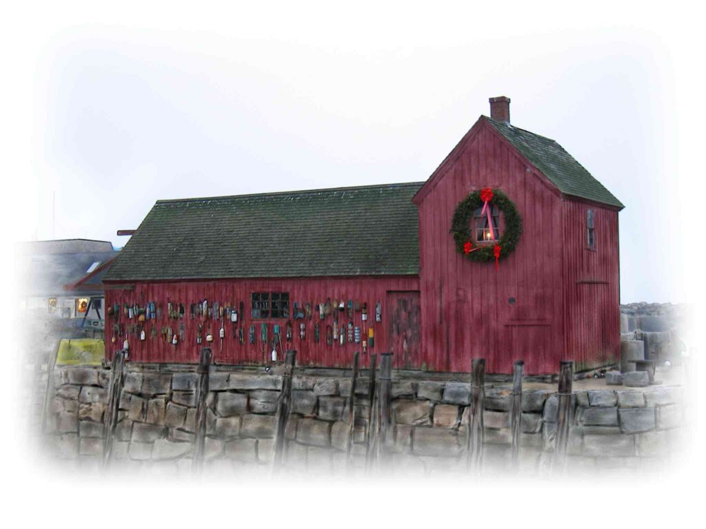
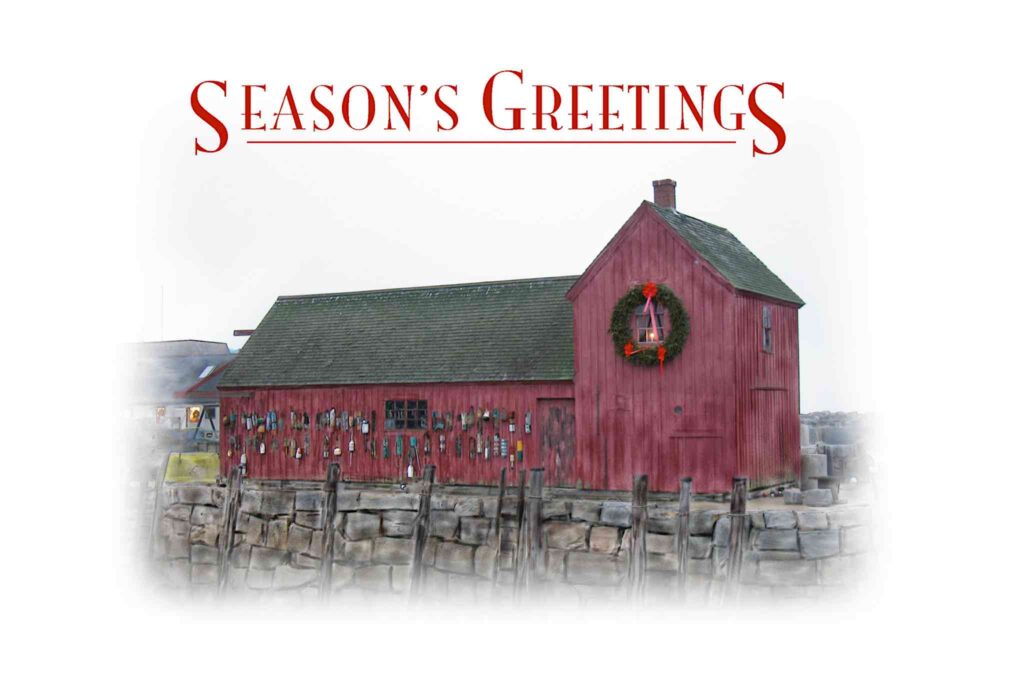
We’ve been going up to Rockport in Cape Ann around Christmastime for years. One of the most famous points in Rockport is the fishing shack replica known as Motif #1, so called as it’s been the subject from numerous artists.
For this card, I took a picture of the Motif #1, then brought the picture into Painter for transformation into a faux oil painting.
The day I shot this had been overcast; I revisited this another year on a sunnier day from another angle.
2005: Rockport Center
Next to the 2013 balloon card, this is my most ambitious design.
I started with a shot taken the previous year, on the same visit as Motif #1, of Main Street taken from Dock Square. The ground was bare and damp. and I decided to try to change it to a snow covered scene. I wasn’t sure I could do it, but I pulled it off!
Nowadays when I modify a picture in Photoshop, I duplicate the background layer without changing it at all; that way I have one layer in an unmodified state that I can start over from if I need to. I didn’t do that here. It’s hard to tell the exact sequence of steps, but it looks like I started in Painter, and laid an initial layer of white over the street. Then I added snow banks to the sides of the road, painted over the cars by extending the bottoms of the stores to the ground, and added texture to the snow on the street. On separate layers, I added snow coating the roofs, bushes, and tree limbs. Finally, I added several layers of falling snow; the multiple layers allowed me to put the falling snow into different planes visually. Finally, I resized the picture to fit the card stock and brought it into Illustrator for layout and to add colored borders.
I don’t remember at what point I started to realize the picture was going to work, but I do remember working on it on a Saturday deep into the morning of Sunday, and printing them off the following day.
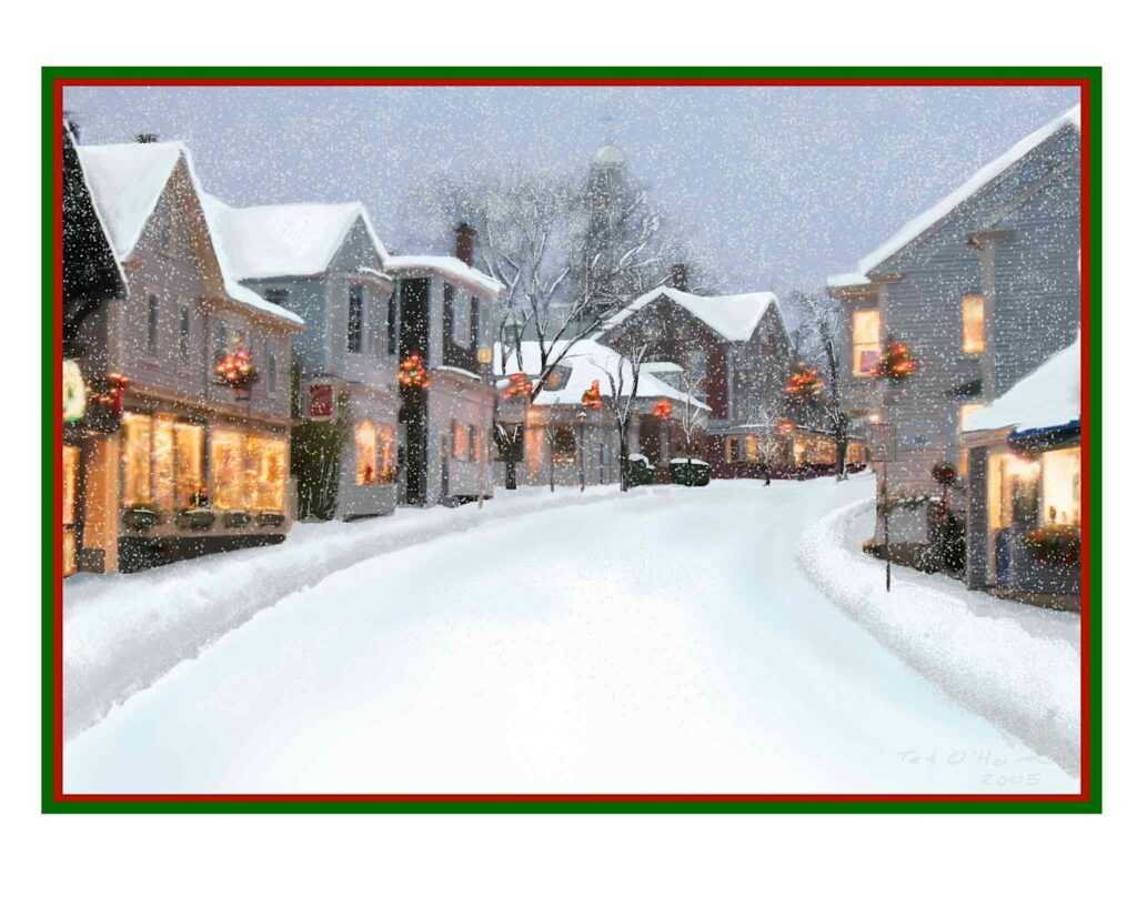
I had two versions of this card; full size, and half size for printing onto quarter-fold paper. Mum got the full size original, and I printed the rest on quarter-fold paper. The printer I had then required a lot of babying, and printing two-up made the job much easier.
2007: Norwood Center
For some reason, I went with store bought cards in 2006, but I resumed my home-made cards in 2007.
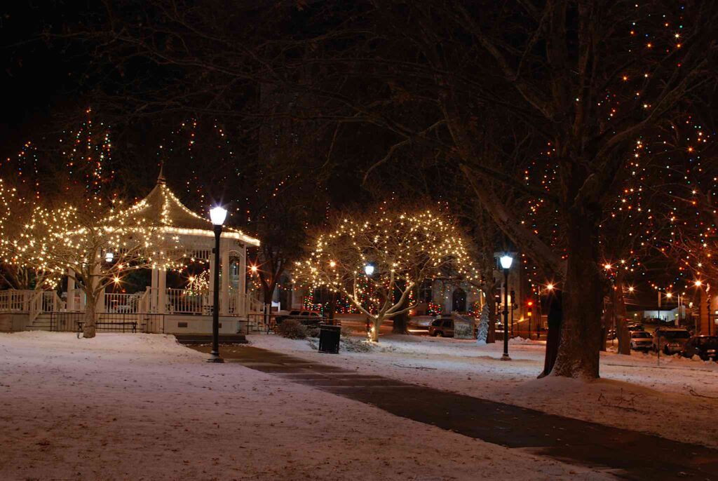
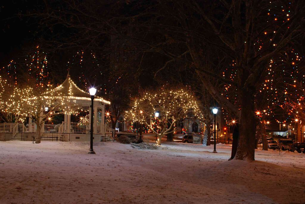
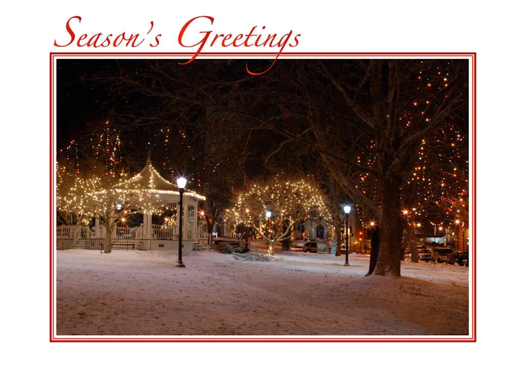
This card started life when we had a light snowfall in early December of that year. I’d noticed the gazebo in Norwood Center while on my way to dinner with my wallyball friends. It captured my eye, and I returned the next evening with the camera and tripod.
I shot it from a variety of angles and exposures, and settled on a picture with the gazebo on the left, a tree with lights on the right, and a path between leading to the gazebo. I made three modifications, all in Photoshop:
- I added a bit of a glow to the lights in the tree.
- I removed an ugly trash barrel next to the gazebo
- The path had been shoveled. I added a light layer of “snow” over it, so that the snow would look fresh while still indicating where the path would be.
I’ve used an image from that same shooting session as a header image for various Christmas themed posts over the years.
2008: Snowy Trees
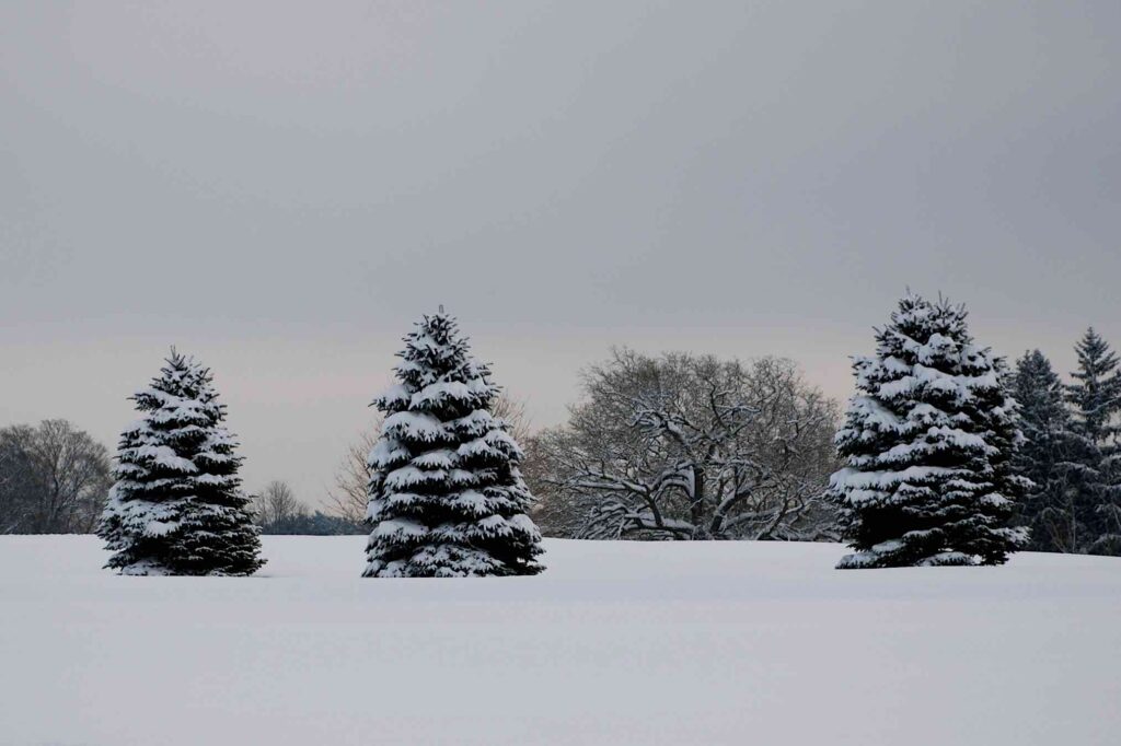
Shortly after I finished the 2007 cards, we had a heavier storm that left us with about a foot of snow. I happened to be off that morning, so after clearing the driveway, I walked up to the golf course with the camera to see if I could get something interesting. I found all the snow covered trees to be visually stimulating. The following year, when it came time to come up with a card, I took a second look, and figured I could do something with a picture of three trees in a row.
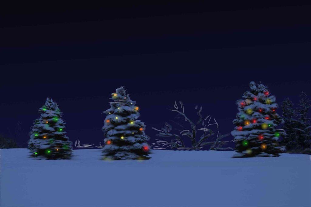
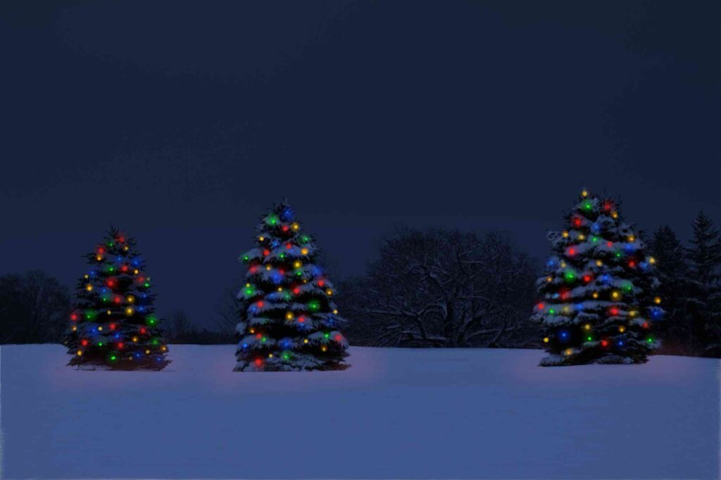
A simple scenic wasn’t what I was looking for, though. I decided to change it to a night scene, and “decorate” the tree with lights. This was my first nighttime conversion, and it took me a while to realize that what I wanted was deep twilight, not night.
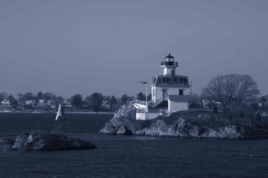
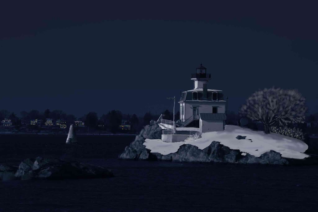
Judging by the files I still have, I initially tried cloning the trees in Painter over a dark blue background, then added lights, but for some reason, found that unsatisfactory — it looks like I was unhappy with the background trees — so I started over in Photoshop, and ended up using the steps I’ve used since when doing a day to night conversion: convert the image to a blue duotone to get the twilight-y look, then add a gradient dark blue layer over the sky to darken it for night. I then cloned the snow on the three trees to lighten it up so it would read better, and added the lights. Next, I added some interactive glows at the base of the trees to make it look like the lights on the trees was lighting up the snow around the trees, and finished off by adding snow in the air, three layers worth, as I’d done with the Rockport image.
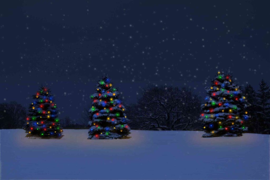

I’ve also used this image as a masthead here on the blog.
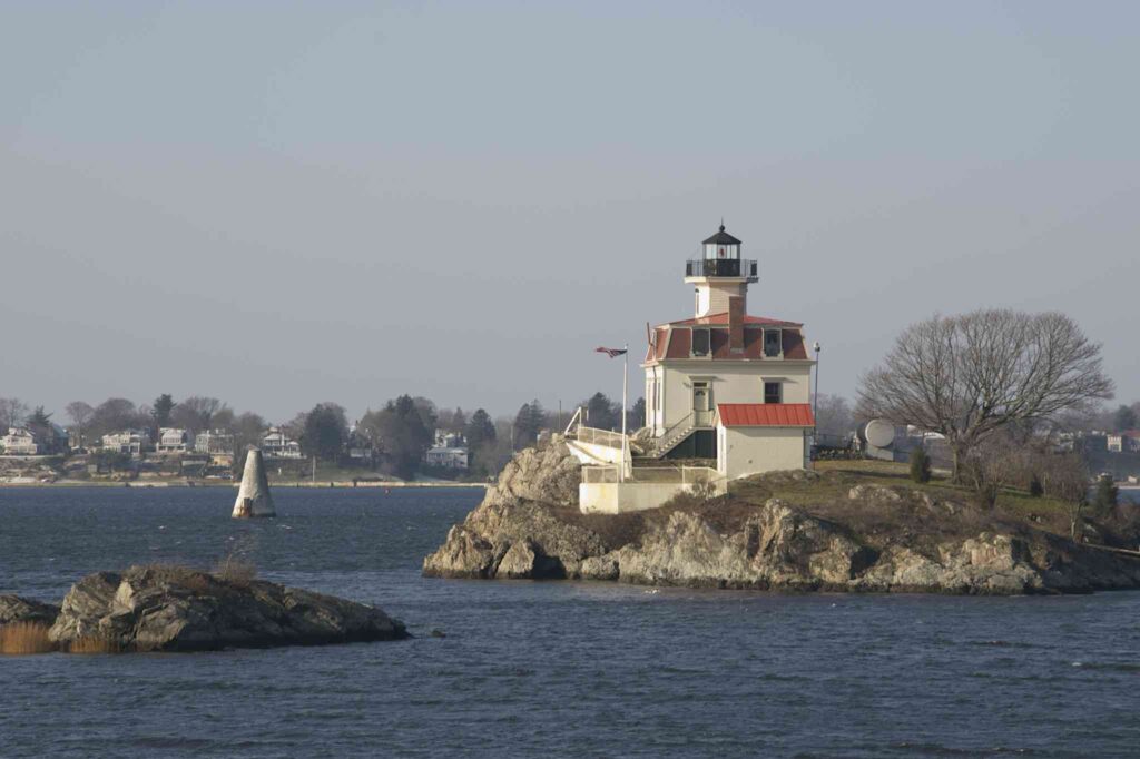
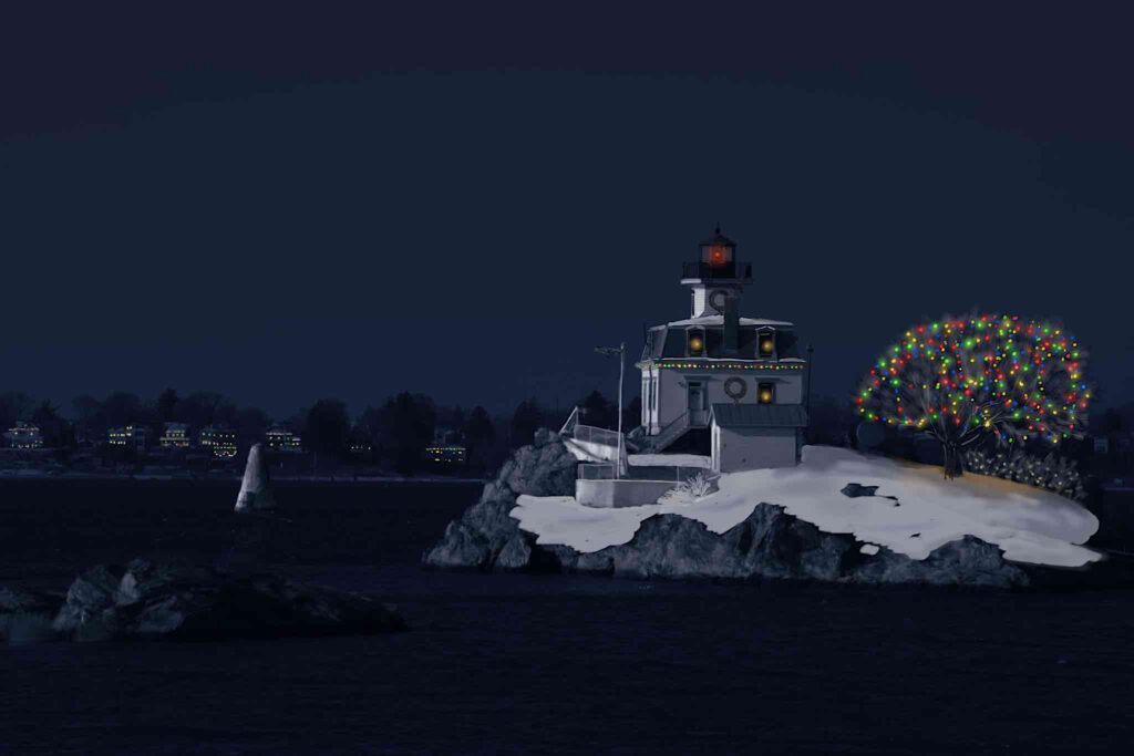
2009: Pomham Rocks Light
I was working in Providence starting in 2000, and by 2009, had discovered the East Bay Bike Path, and had seen the Pomham Rocks Lighthouse.
The lighthouse is quite distinctive architecturally. It’s not a standard cast iron cylindrical lighthouse; it’s a Victorian type house with a mansard roof with a square tower with chamfered corners projecting from the middle. The red warning beacon is in the tower. It sits, with a small tree next to it, on a small rocky island just offshore, quite visible from the bike path. I decided I wanted to do a picture of that, seemingly at night, under cover of snow, with the lighthouse and tree decorated with lights.
I didn’t have a suitable picture to start with, so I took a run down to Providence on a bitterly cold Sunday morning to take one. Judging by the number of duplicate files and dead ends I have on my hard drive, it took me a while to figure out how I had done the day-to-night conversion the year before and re-create it. I persevered, though, and eventually got an image I was happy with.
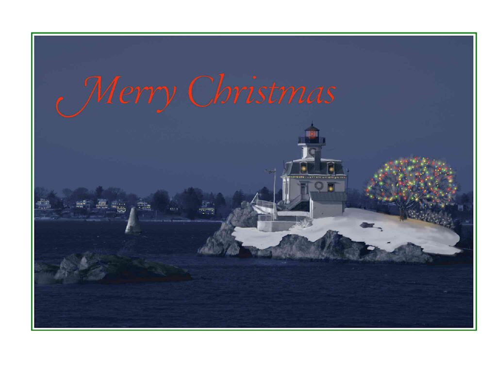
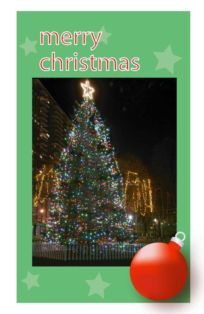
2010: Tree and Ornament
This year’s card was a bit of a departure for me. Possibly feeling burnt by the work it had taken the year before, this year’s card featured a minimum of photo retouching. Instead, I took a picture of the Boston Christmas tree from a previous year’s First Night, darkened down the background a little, then took the image into Illustrator for placement onto a green background, fairly modern text, and in the lower right hand corner, a red ornament created in Illustrator that didn’t make any pretense of being photorealistic. It was relatively modern looking, and pretty atypical for me. I haven’t done anything like it since, possibly since I don’t have easy access to Illustrator anymore.
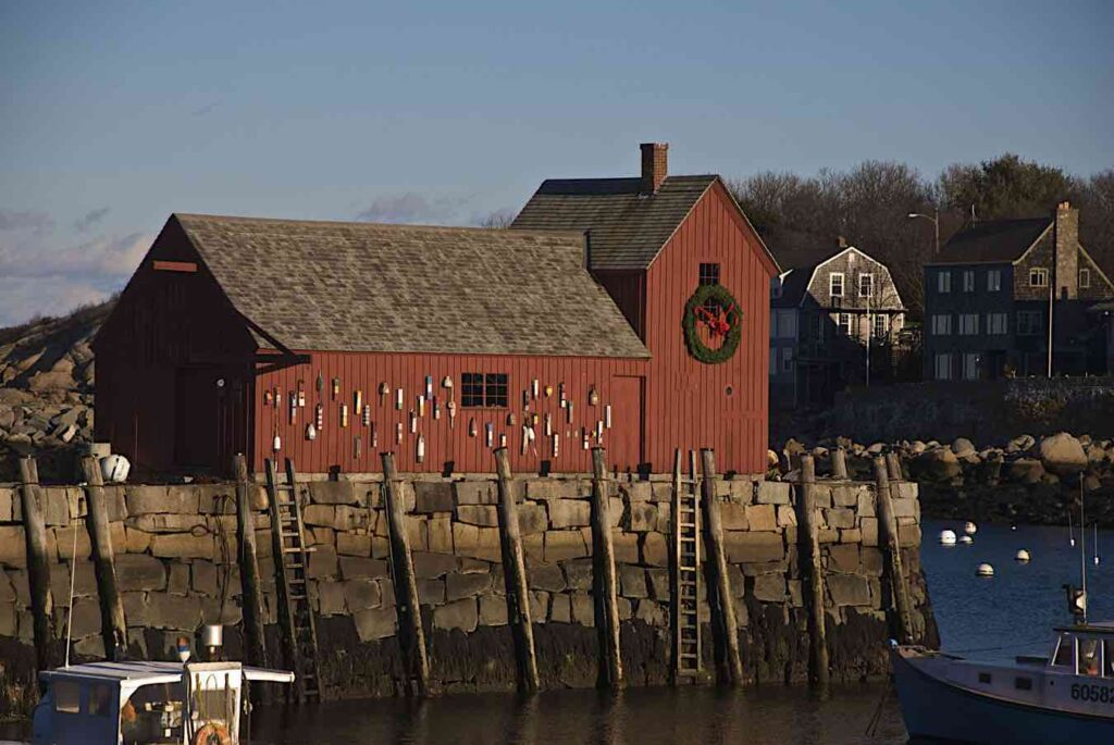
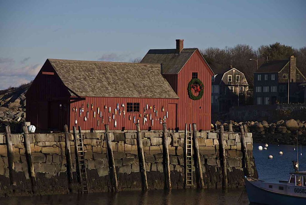
2011: Motif #1 Sunlit
For 2011, I returned to Rockport and Motif # 1 again. I started with a picture I’d taken in 2009 of Motif #1, this time sunlit. The picture was nearly perfect… aside from the roof of a fishing boat poking up from the left bottom edge. I took it into Photoshop to remove it, intending to manually clone the jetty rocks to cover over the boat. Then I remembered this new “Content Aware Fill” thing, and gave it a try — I just cut the boat out, and it filled in the space automatically, as if the boat had never been there at all. I seem to recall having to make a few minor touch-ups, but I also remember being finished with the photo work in jig time.
2012: Ornament
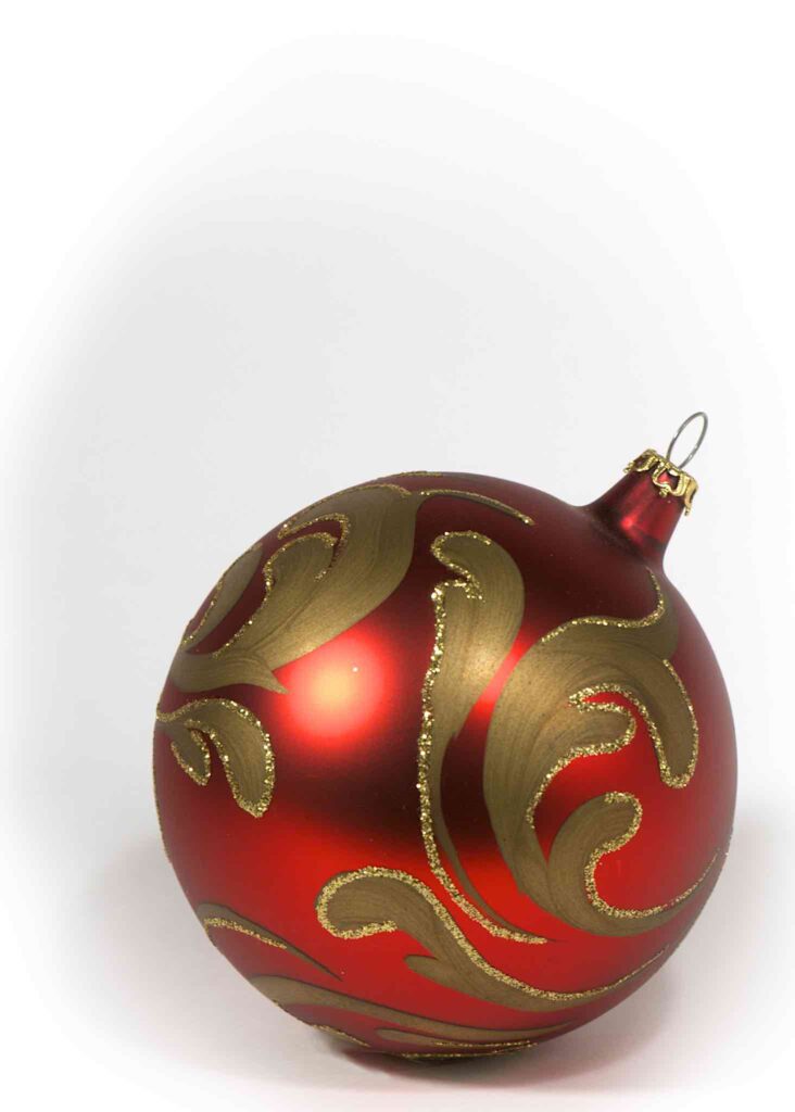
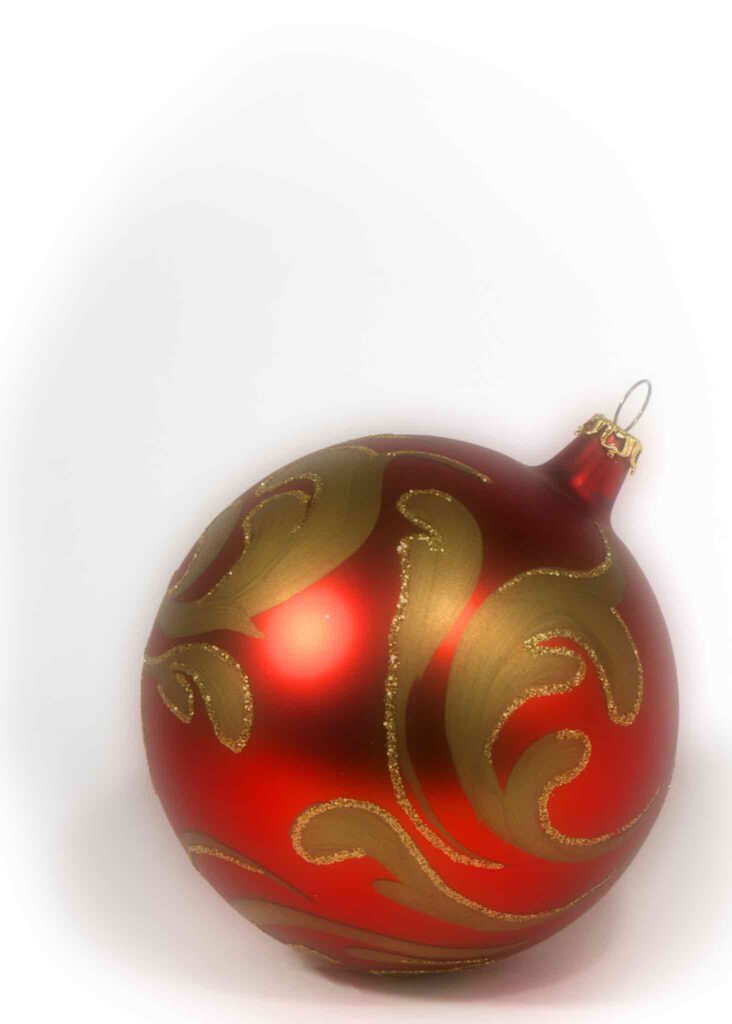
For 2012. I decided to shoot an ornament against a white background. This was in the days before my tabletop studio, so I improvised a lighting setup. I used one big sheet of white cardboard as the background, curved it so that part was under the ornament and part was behind it, with a shallow enough curve that the background was seamless. I used another sheet of white cardboard as a a reflector.
I tried two different ornaments: a plain shiny glass one, and a more ornate one with a slightly frosted surface with gold glitter patterns on it. I ended up going with the fancier one — the reflectors were too visible in the shiny glass ornament, and the fancier one looked nicer anyway. I ended up adding a diffusion layer over the ornament to give it a soft focus effect.

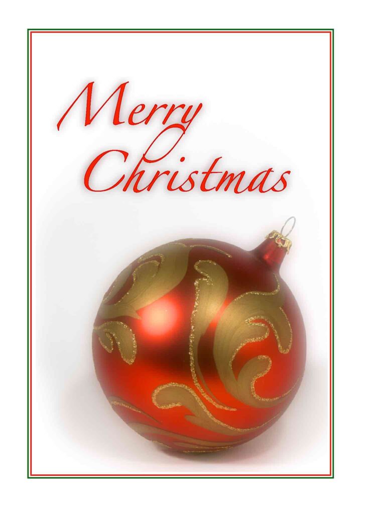
I didn’t write a “making of” post that year, but I did use an image of the card for a Merry Christmas message.
So those are my early cards. It’s been fun looking back, I hope you’ve found it interesting as well.
