I really had no idea what I was going to do about a Christmas card this year, or even if I wanted to do one. I have less free time this year, and I wasn’t really feeling it. There is a big part of me that wanted to do a jump cut to February.
Still, a tradition is a tradition, and so, at the beginning of the month, I was wracking my brain trying to come up with an idea. I didn’t get as frantic as I did in 2013 — I have more confidence in myself now that I’ll figure out something — but I was definitely feeling bereft of ideas.
And then, one day, I was looking at pictures with Mum, and for some reason, I decided to look at my iPhone pictures. And there is was, a picture I’d taken with the iPhone last year:

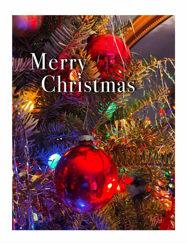
Looking at it, it was nearly perfect. The only thing that bothered me was that you can see my hands holding the phone taking the picture. So I took it into Photoshop, and cut the hands and phone out of the picture, using Content Aware Fill, in several steps. I also bumped up the contrast a bit because printing on card stock tends to flatten the contrast a bit:

Content Aware Fill is an amazing thing. It took me maybe two minutes to take care of it; I remember when it would have taken me hours.
Then it was time to lay out the card. Once again, I used two-up card stock, using Apple Pages to lay it out. Vertical cards are actually laid out sideways on the template, so I just grabbed one of my older cards, replaced the images in them, updated the date on the back, and then had to decide on typography.
This year, I decided on white Bodoni 75 with a thin outline and drop shadow for better separation, placed directly on top of the picture. I removed the borders on the text box this year. I’m pleased with the way it came out — the type fits well with the picture, and it looks almost like a book cover.
The hard part this year was what to say inside. This has not been a good year for me or the family, because of Mum’s situation. Do I use the space to send a Mum update? But I send cards to a variety of people, and it wouldn’t be appropriate for everyone I send cards to. And a single message isn’t appropriate for everyone. In the end, for the pre-printed part, I went with the classic “Merry Christmas & Best Wishes for a Happy New Year”.
And here’s the finished card:

Merry Christmas, everyone.
