I was really of two minds as to whether I wanted to make a card this year. For some reason, perhaps the weather, perhaps the compressed calendar this year, I really wasn’t feeling it. Still, I spent some time going through my photo library to see if I could come up with some ideas, and quickly zeroed in on a series of pictures I took out in Colorado five years ago after a snowstorm. I wanted a picture with evergreen trees that were Christmas tree shaped, and decided I would transform it to a night scene, and ‘decorate’ the trees with lights. I decided to go with this picture, taken in the Arapaho State Forest, as we traveled from Breckinridge to Canon City:
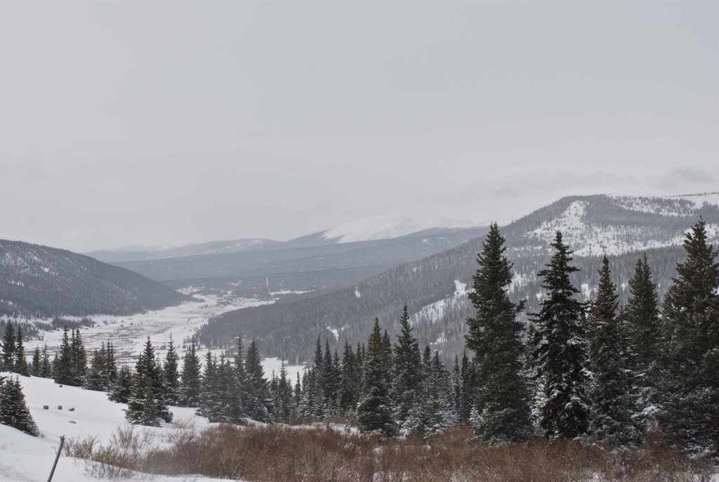
Original Photo
I liked the arrangement of trees from foreground to the background, with the mountains behind. The only change I made to the picture itself was to remove the stick in the lower left corner.
I’ve done a day to night conversion a couple of times before, mostly by trial and error, but by examining past cards, I was able to figure out a precise series of steps. One thing to keep in mind is that even though an actual night scene would be pitch dark, for the card, it’s better to go with more of a twilight-y look: dark, but not too dark, and blueish overall. The first step is to make a copy of the scene, and convert it to a blue duotone:
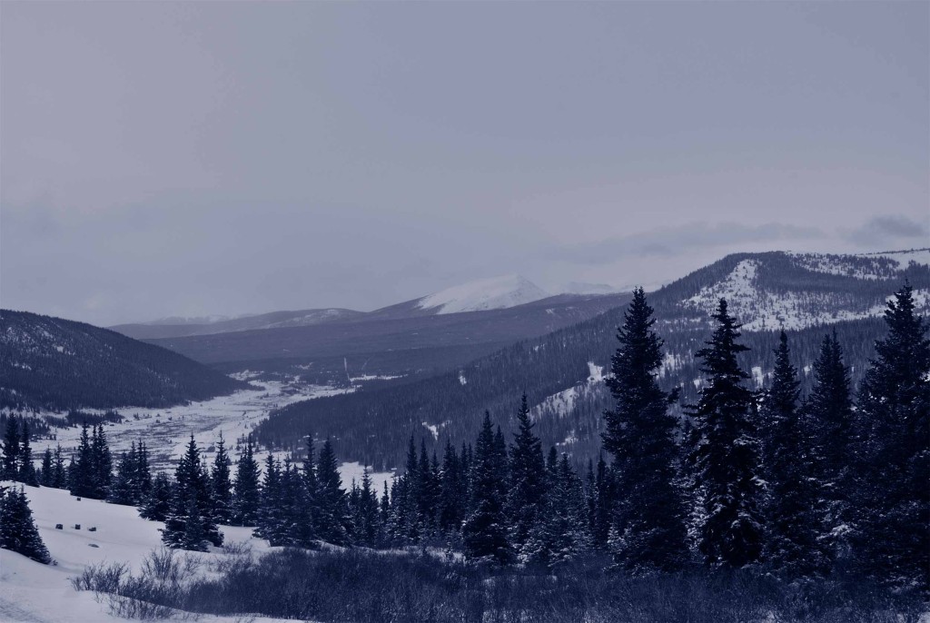
Blue Duotone of the scene.
Next, I lay over the scene a blue gradient, using a blend mode of ‘multiply’ to darken the darkest part. For this scene, I used two gradients, one overall, and a masked one for the sky that gets lighter near the horizon. It took a little adjusting to get the opacity of the gradient layers right:
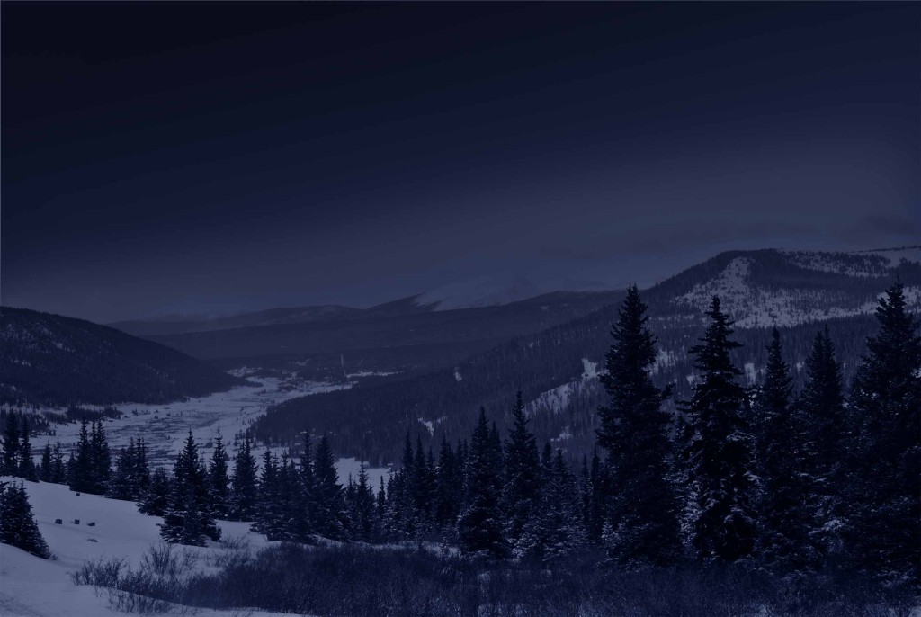
Gradients applied to the scene.
The final touch is to lighten the snowy parts of the scene, because they would reflect moonlight more. I used to do this by hand; this time I used the select tool to select the white parts of the screen, and refined the selection as needed, and added a copy of the scene with a layer mask allowing only the snow to show through:
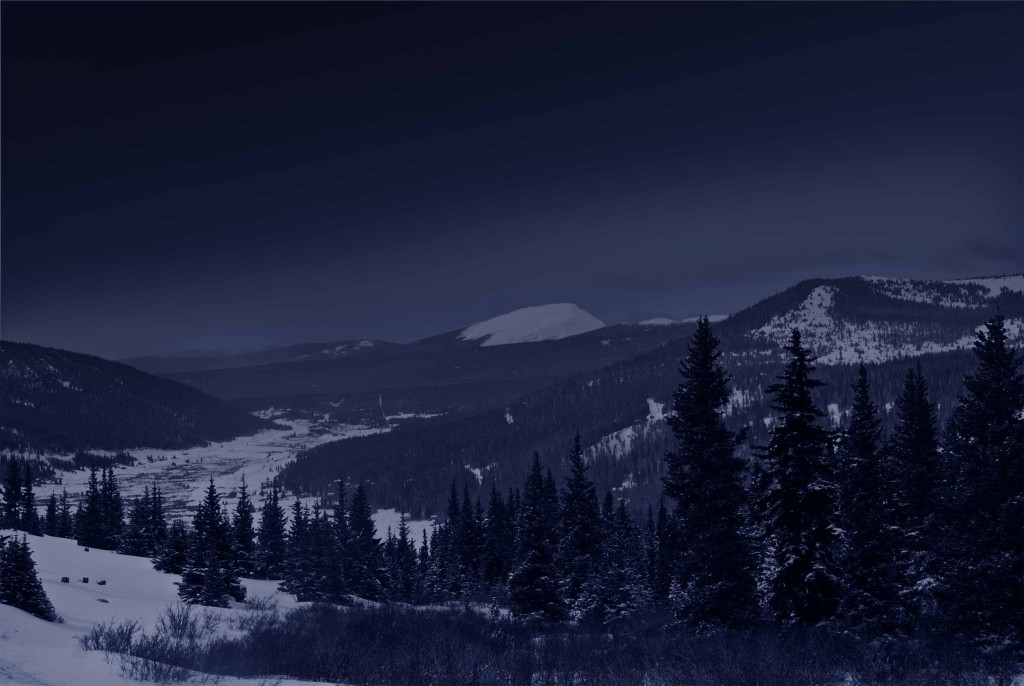
Snow reflections added.
So now I had a creditable night version of the scene. It was time to get decorating. The first thing I did was add lights to the foreground trees:
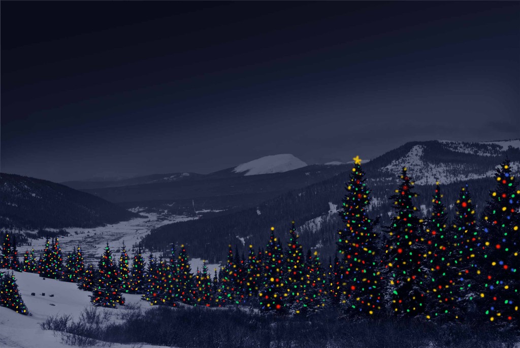
Lights on foreground trees
It was pretty, but it didn’t feel like I was tying the lights in with the rest of the scene. I added some interactive lighting —glows on the lights, reflected light on the snow, and on the foreground grass:
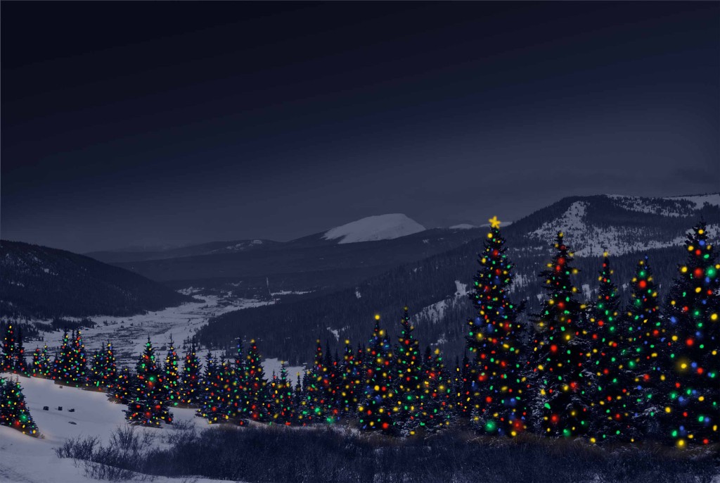
Interactive light added
It still felt like something was missing. Then it came to me — I needed lights on the background hills too. I found a brush that would “sprinkle” dabs as I painted, and started painting in the background trees. It took forever, and I even discovered a pair of houses in the far background, but in the end, this is the finished product. I think in hindsight, it needs much more interactive lighting within the foreground trees to lighten them up, and possibly some falling snow.
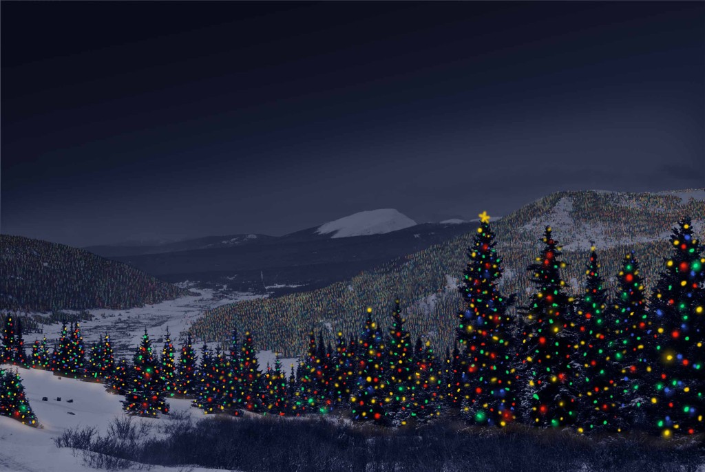
The finished scene
Merry Christmas, everyone.
