I spent the last two days of my vacation in Ticonderoga, New York (and driving to and from there). Ticonderoga is the site of Fort Ticonderoga, site of some battles during the French and Indian Wars and the Revolution, but if I’m being honest, the reason I went was the Star Trek Original Series Set Tour.
I heard about the tour last year, and have been thinking about going since. Originally, I was going to do the Quechee Balloon Festival via motorcycle again this year, then extend the trip to Ticonderoga. Unfortunately, jury duty put the kibosh on the balloon festival, and tendinitis is preventing me from spending more than an hour or so on the bike at any one time. So I figured I’d take this week off while my family was on the Cape, spend a couple of days on the Cape, a couple of days on Martha’s Vineyard, then drive up here and see the set tour and Fort Ticonderoga.
These are not the original sets. Aside from a few scraps, those were destroyed when the series ended 50 years ago. Elvis impersonator and Star Trek fan James Cawley managed to obtain the set blueprints, and re-create the sets, based on photographs and the old plans. He actually shot a web series of original episodes on the sets, but stopped when Paramount set forth rules regarding what they would permit from fan productions. So he licensed the rights to the sets, and opened them up to the public. The tour is located in a converted storefront on Ticonderoga’s main street.
My original plan was to drive up on Thursday, check into the motel, and then do the tour on Friday morning and spend the rest of the day doing Fort Ticonderoga, staying over night somewhere — I had no place booked — if necessary, and then heading back on Saturday.
When I drove up, though, as I was getting close to the resort, the GPS had me turning onto Montcalm Street — the same street the tour is located on. And there it was, and it was only about 4:15. I poked my head in, and sure enough, there was time enough to do the tour today.

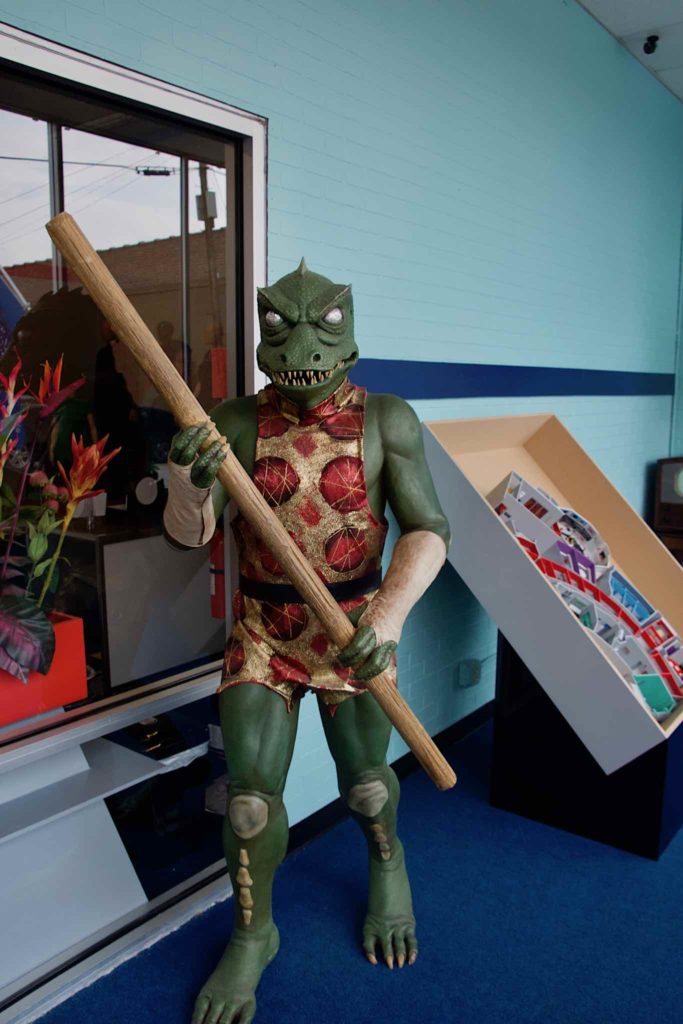
I had the sets to myself, though they did say when I asked that weekends were very busy. I had a college student dressed in a sciences (blue shirt) uniform as my guide. The tour starts on the backside of the sets, by a set of plywood doors. The guide explained how sliding doors were very futuristic in the 60’s, and were actually operated by hand, and then he pulled a cord, the plywood doors opened, and I was on the Enterprise.
Well, sort of. The tour doesn’t attempt to replicate the Enterprise, it purports to reproduce Desilu Stage 9, where the standing sets were built. These are replicas of the sets, not the ship.
They say the sets were built to the original plans. This means the sets are the same size as the original sets, and it’s striking how small they actually were. They look much bigger on screen, but I was able to easily recreate the look in my own camera, so I have no reason to doubt them. Incidentally, photography is both permitted and encouraged.
The first set you enter is the Transporter Room. The chamber has mannequins of Kirk and Spock standing on the pads. The control panel has Scotty’s controls, though it seems a little lacking in detail.
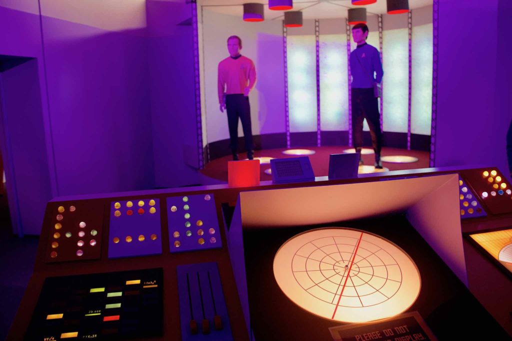
One thing I didn’t like about the tour is the lighting. The overall light level is low, and they make extensive use of colored LEDs. I don’t know if the intent was to hide defects, or to reproduce original series cinematographer Jerry Finnerman’s dramatic lighting, but it’s not right. Finnerman used more washes of color, rather than spot color, and the color was usually behind the actors, who were lit in white light. The LEDs are also bluer than the original lighting, so the color just doesn’t feel right.
From the Transporter room, we entered the main corridor. My guide pointed how how the corridor was carefully laid out so you can’t see it end to end, because of the curves. This was another trick to make the ship seem bigger.
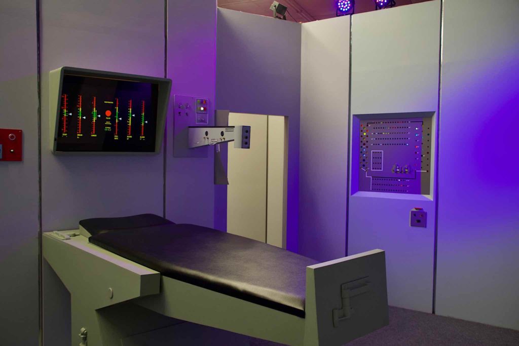
Next stop was Sickbay. First, we stopped by the diagnostic bed, then we went to the ward. Unlike the original sets, the diagnostic panels were actual computer displays.
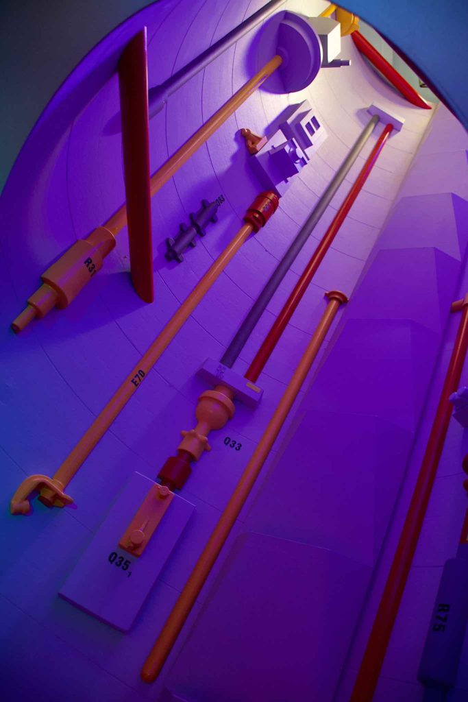
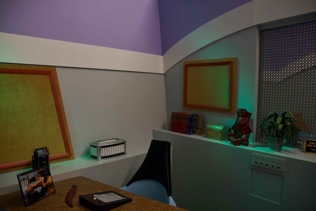
We worked our way around the corridor, stopping in the briefing room, noting the intercoms on the corridor walls, seeing the Jeffries Tube, and spending some time in the Captain’s Quarters — which was also Spock’s quarters too. The set actually has two doors, with different labels, and they would re-dress the same set differently to portray different areas. Then we moved on to Dr. McCoy’s office, where the guide pointed out that one of the skulls on display is that of a great big bird. This is visible in the series if you look for it, and it’s an in-joke– Gene Roddenberry’s nickname was The Great Bird of the Galaxy.


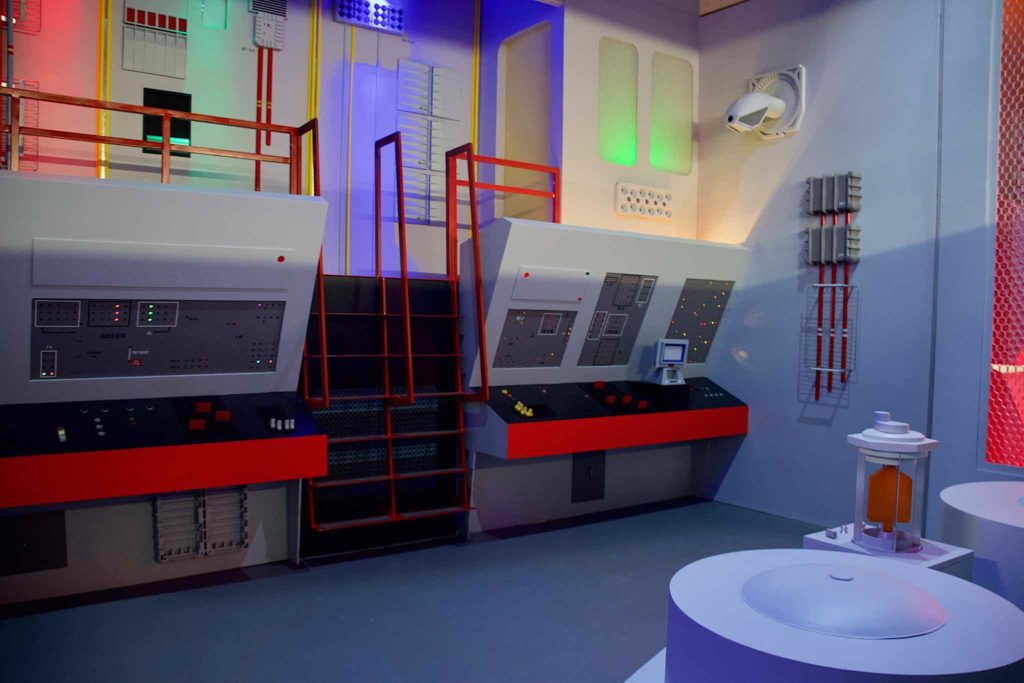
Next stop was Engineering. On screen, it looks huge. In person, not so much. The set is in a latter season configuration, with ladders leading up to a set on stilts, which I was not allowed to climb.
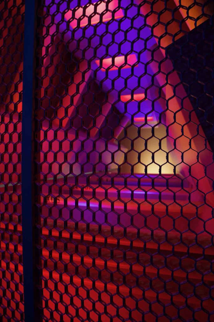
One of the tricks the set uses is forced perspective. At the rear or the set, behind a wire mesh, you can see the engines glowing red, seeming to go back forever. On camera, the engines seem to recede into the distance. In person, the red glowing engines can be seen to be a kind of a pyramid shaped dingus mounted with its base to the wire mesh, about 6 feet deep, with lights from below to sell the idea that the engines are hot and working.

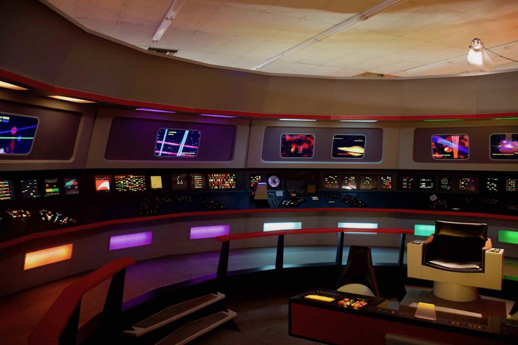
The final stop on the tour is the bridge set. I don’t know if Cawley originally built it in pie shaped pieces like the original was, but it’s mostly in a full circle. It’s surprisingly small. On screen, it looks big, but in reality, it’s not much wider than the longer dimension of our living room.
When the original bridge set was built, it was intended to have the upper screens around the perimeter of the bridge displaying information via rear projection, and you can see this in the first pilot. This turned out to be too expensive, and the screens were replaced with static images, and after the first season, were rarely used for the story.
In this bridge, all the displays are computer screens, both the lower winky-blinky displays around the bridge, and the larger upper monitors, and they’ve taken advantage of this to add some detail. The upper screens now look like they’re actually in use.
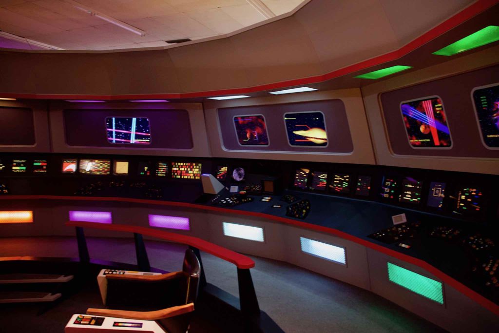
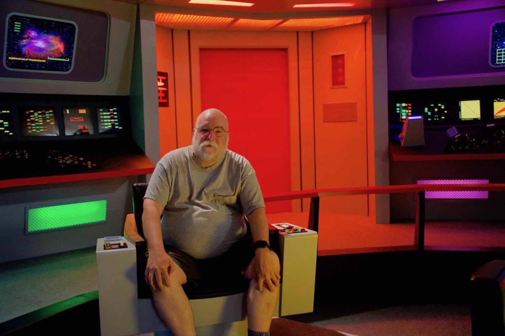
We walked around the bridge for a few minutes, then, for the pièce de résistance, the guide offered (kind of insisted) to let me sit in the command chair while he took my picture. That done, I took a few more pictures, and the tour was done.
Overall, I’d say the tour was worth the trip, even though it was short. The set replicas were well done — in some cases, detail was a little lacking, but Engineering and the Bridge were fantastic. It points up the overall soundness of Matt Jefferies basic set design — the basic layout, and color palette used. The actual controls — the buttons, switches, and displays with their flashing blocks of color and raised jewelled lights obviously pre-date any kind of UX design, but it would be very interesting, I think, if someone were to take the basic look of the set design, and add detail. Add more detail to the displays, and make them actually present some (fake) information, as has been done with the upper perimeter monitors here. Rearrange the controls so they actually appear to control something, and add labelling. I think you could wind up with a set that keeps the same basic look, but feels even more realistic.
