Part of the reason I was in such a rush to replace my old Mac was that it was getting close to the time to make this year’s Christmas card. Once the new Mac was up and running, one of the first things I did was start perusing my Aperture library for ideas.
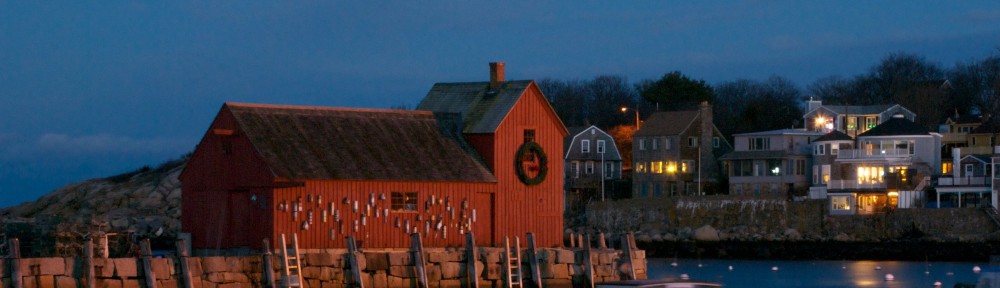
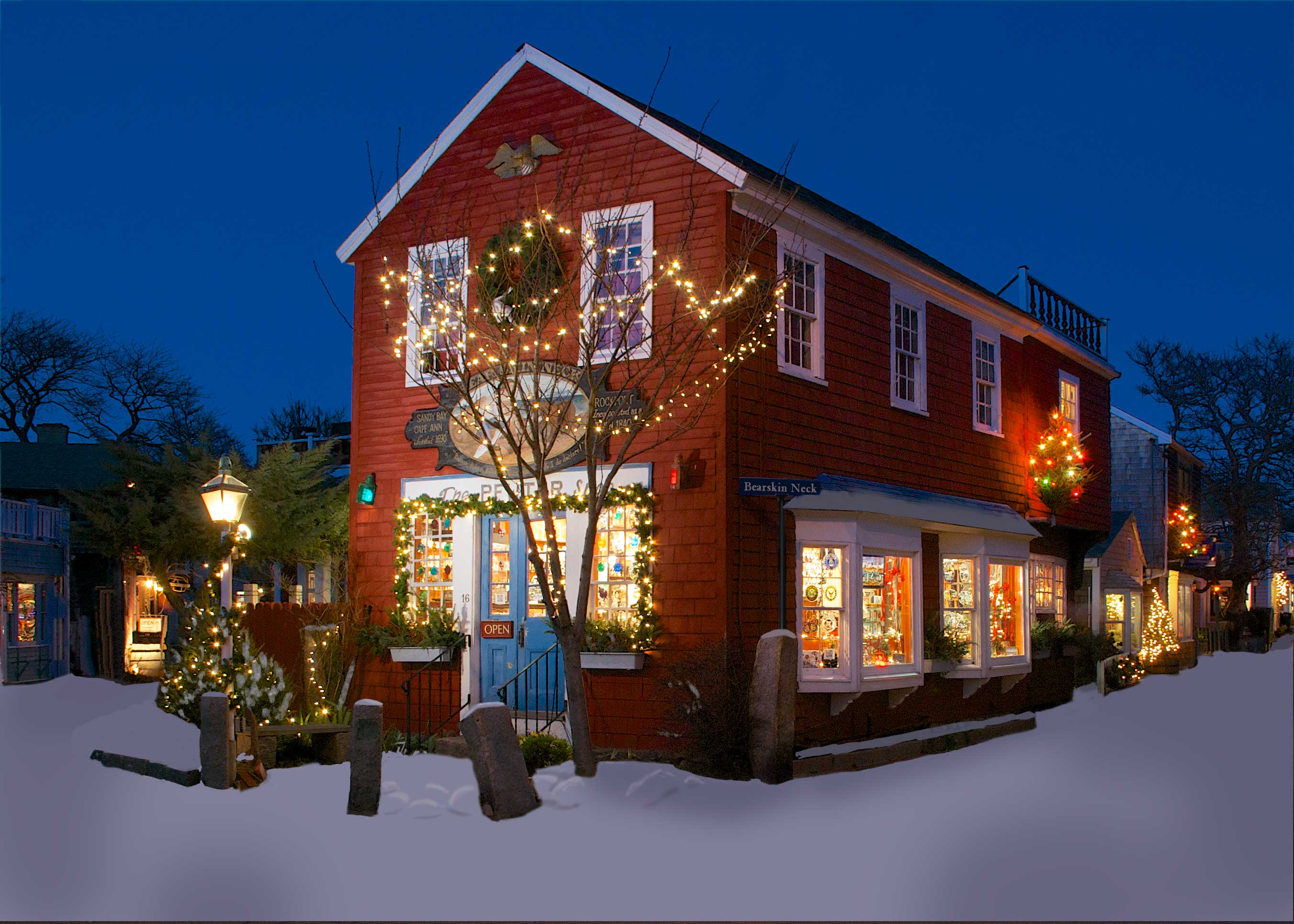
We generally go up to Rockport during the Christmas season, to shop, see the sights, and soak up the atmosphere. My mother also loves their Christmas pageant, a re-enactment of the Nativity. A couple of years ago, I returned a second time to shoot the Christmas lights around dusk, without having to worry about other people getting bored or cold. Aside from the fact I forgot to put my newly charged battery in the camera, and had to buy a new one, it was a successful trip. The masthead for this page, of Motif #1, came from that trip, and I got a bunch of pictures of the Bearskin Neck shops at dusk, with all their lights on. Looking through the Aperture project for this trip, I decided this picture had potential:
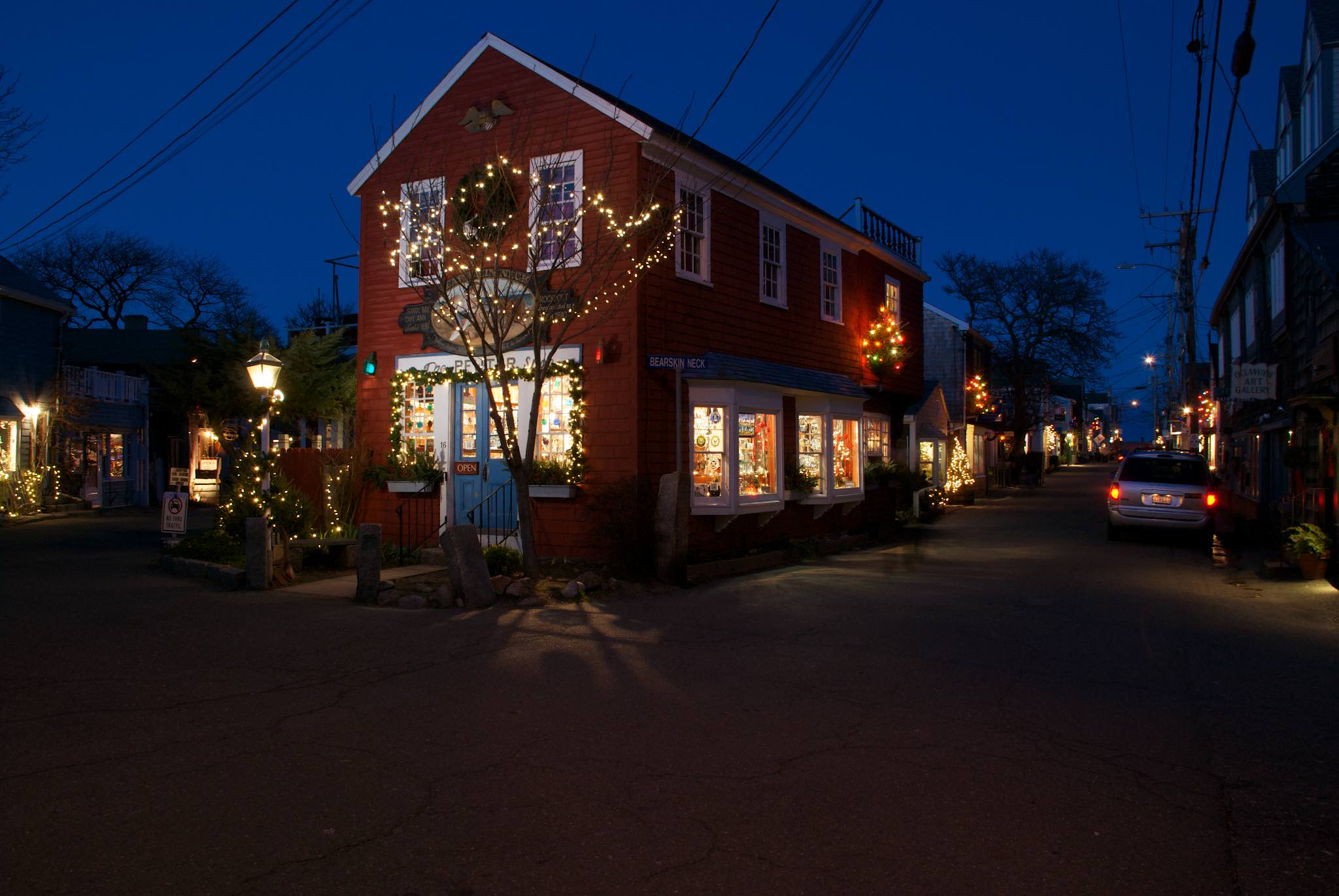
It’s kind of a mess though — we have the car on the right, it’s too dark, and there are two sets of telephone lines overhead.
Retouching
The first couple of steps I was able to perform in Aperture. I cropped the picture, getting rid of the car, and tightening the focus on the shop. I also did some tonal corrections, lightening the body of the shop. I then exported the file to Photoshop.
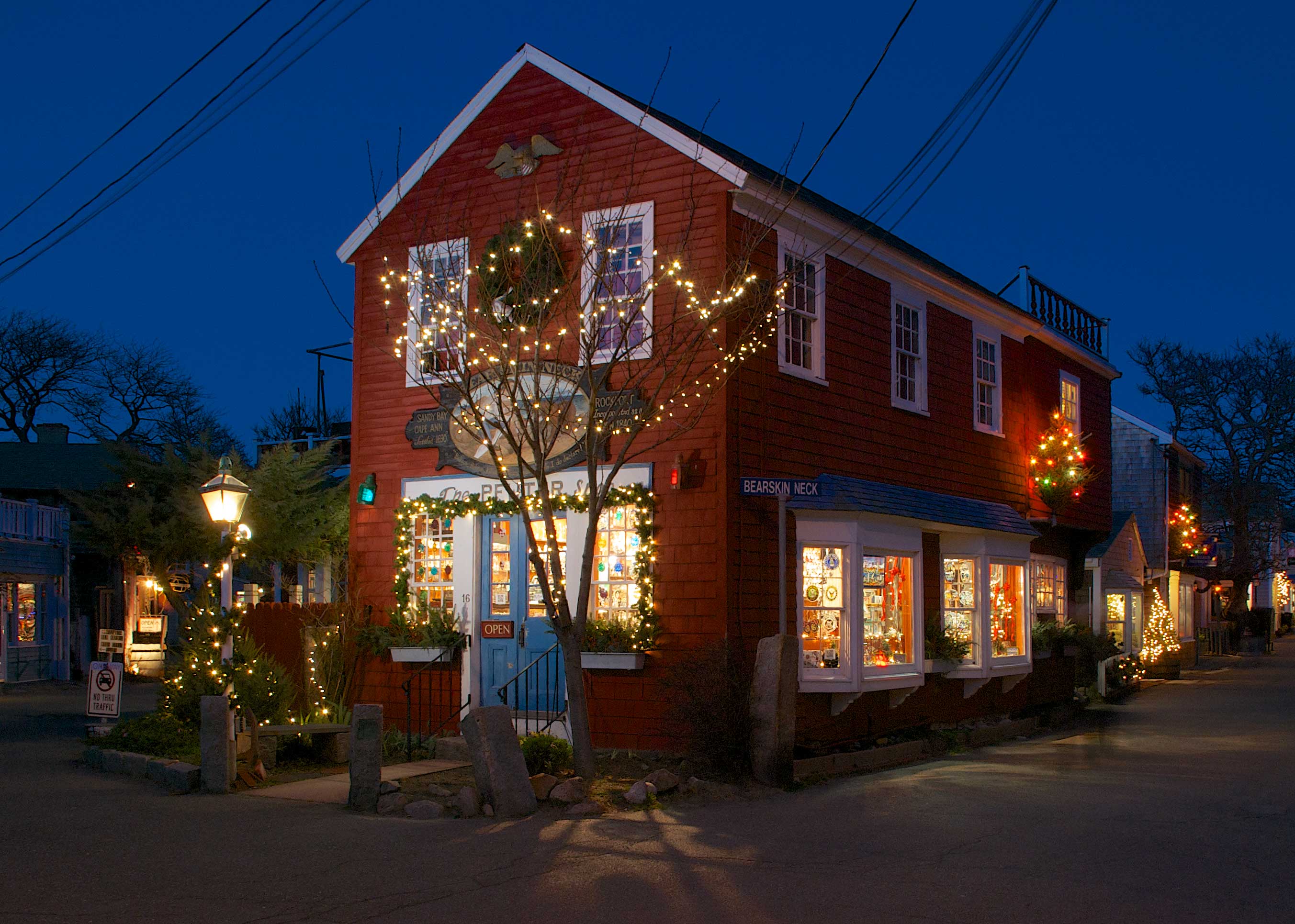
The next step was to clean up the basic picture. I got rid of the telephone lines, and the No Parking sign on the left side of the picture. I lightened up the siding of the shop, while darkening the shop windows. I found the “Bearskin Neck” street sign to be rather jarring, so I replaced the bare galvanized steel pole with a painted pole, and the rather municipal lettering on the sign with something fancier:
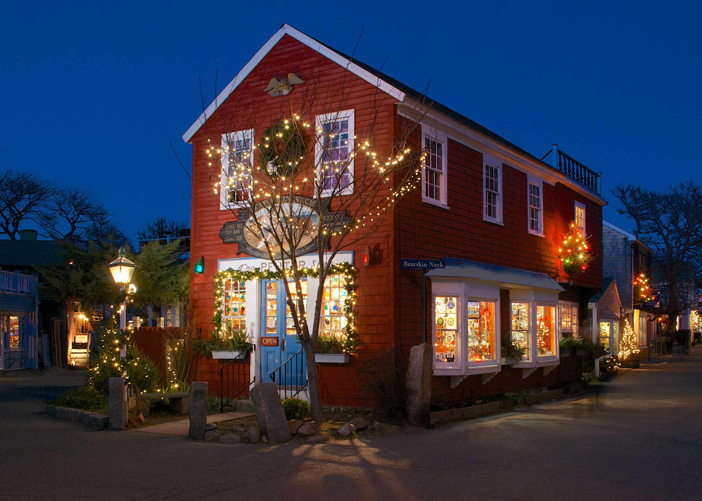
Version 2. More tonal adjustments, telephone wire removal, sign removal
So now it was starting to turn into something. There was just one thing missing: snow.
I’d forgotten how tedious it is adding snow to a scene. Basically, you have to imagine each place in the scene where snow will accumulate, and try to figure out how light or dark it will be in that spot. The first thing I did was to rough in a layer of snow over the whole foreground:
Snow on the ground. This has actually been refined some — there’s a little snow on the posts and trees, and the snow now conforms to the building perspective. This was not the case originally.
After doing the initial snow layer, it was time to add snow to the building roofs, and the trees and the plants in front of the shop. Along the way I made an interesting discovery: I made a very transparent copy layer of the scene, and laid it above all the snow layers to act as a guide. I found it actually made the snow look better because it was giving me the glow lighting from the window. So after adding all the snow to the roofs, the plants and the trees way in the background, I turned my guide layer back on, and used a layer mask over the top of it so it was only visible on the snow in front of the shop. And here’s the final picture:
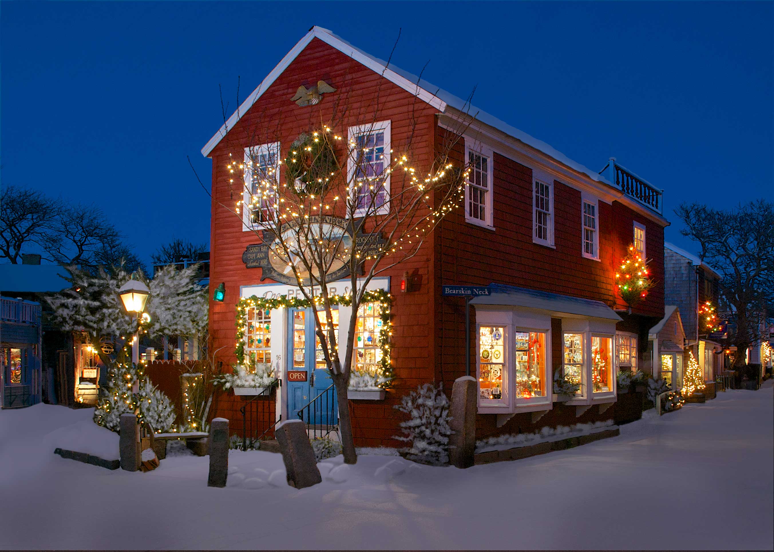
Final version of the Photoshop file
Layout and Production
The next step was to actually create the cards, and here I had a problem — or thought I did. I’ve been using an old PowerPC version of Adobe Illustrator to actually lay out my cards for the last several years. Last year, after creating the picture, I rebooted my laptop from an external hard drive that had Snow Leopard on it, and laid out the card that way.
I knew this Mac wouldn’t run Snow Leopard — a Mac won’t run on versions of OS X older than its original system software. I decided to check out Pages, and found they already had a template for the kind of two-up cards I like to use. I ended up keeping the font on the template, Avenir Ultra Light, but laid it over the card content, instead of under it, and unmasked more of the picture content than the template had, and used a red top border over the text. I was able to add a pair of upside-down text boxes for the back side of the card.
I ran into a couple of problems printing. First off, my printer doesn’t like card stock, and smudged a lot of cards. Second, on the left hand card of the page, I was getting an extra white line under the red top border of the text. I ended up removing the red border on that side, so that the white line looked intentional, end positioned it in printing so that if a given sheet smudged, it would be on that side, rather than the “good” side. (I discovered after the fact that the white line was an additional invisible text box; getting rid of it removed the white line.)
And so here it is, my 2014 Christmas card:

Final Card
Merry Christmas, everyone.